Reader Design SOS: 3 Reader Homes & The Quick, Affordable Fixes We Suggest (The Stairwell Is A Favorite)

Welcome back to this month’s installment of Design SOS, where we take a few reader-submitted rooms (and any corresponding concerns) and do some design quick takes and affordable fixes to help them get closer to a space they love. As a regroup, Emily took the first one, helping some readers shuffle a few things around to make improvements; Jess was second to bat with her amazing suggestions as always, and now it’s my turn!
As stated in previous posts, this is more of a post about offering ideas that don’t require a huge lift or an enormous budget to instantly make your home feel more pulled together than it is “rip it all to shreds and start over.” Some paint, maybe wallpaper if you’re feeling adventurous, throw up a new light, or lean into something you’re already doing, and boom, Design SOS turns into Design WOW.
Let’s jump right into the first one; this is going to be fun.
Bare Pass-Through Stairwell
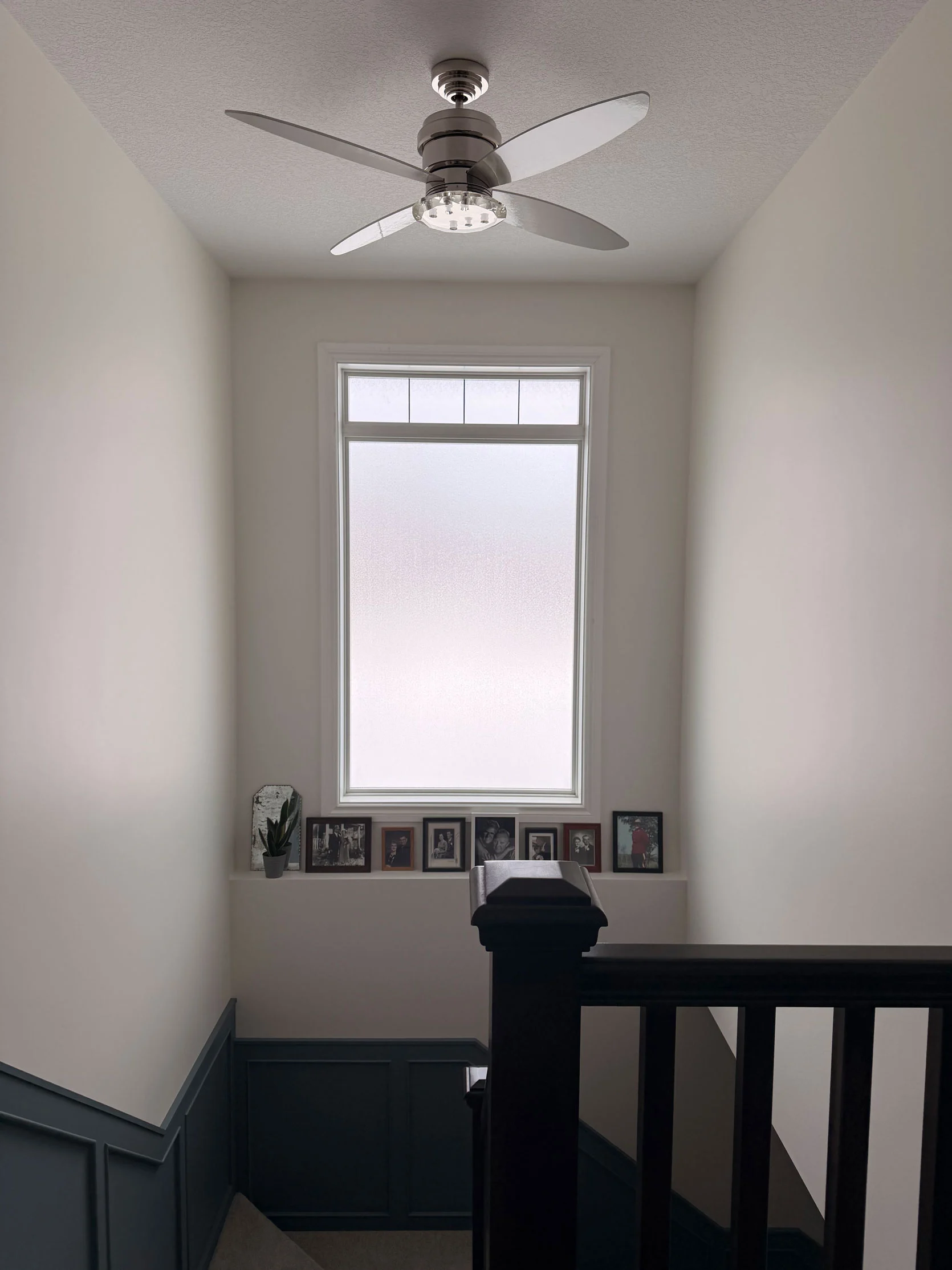
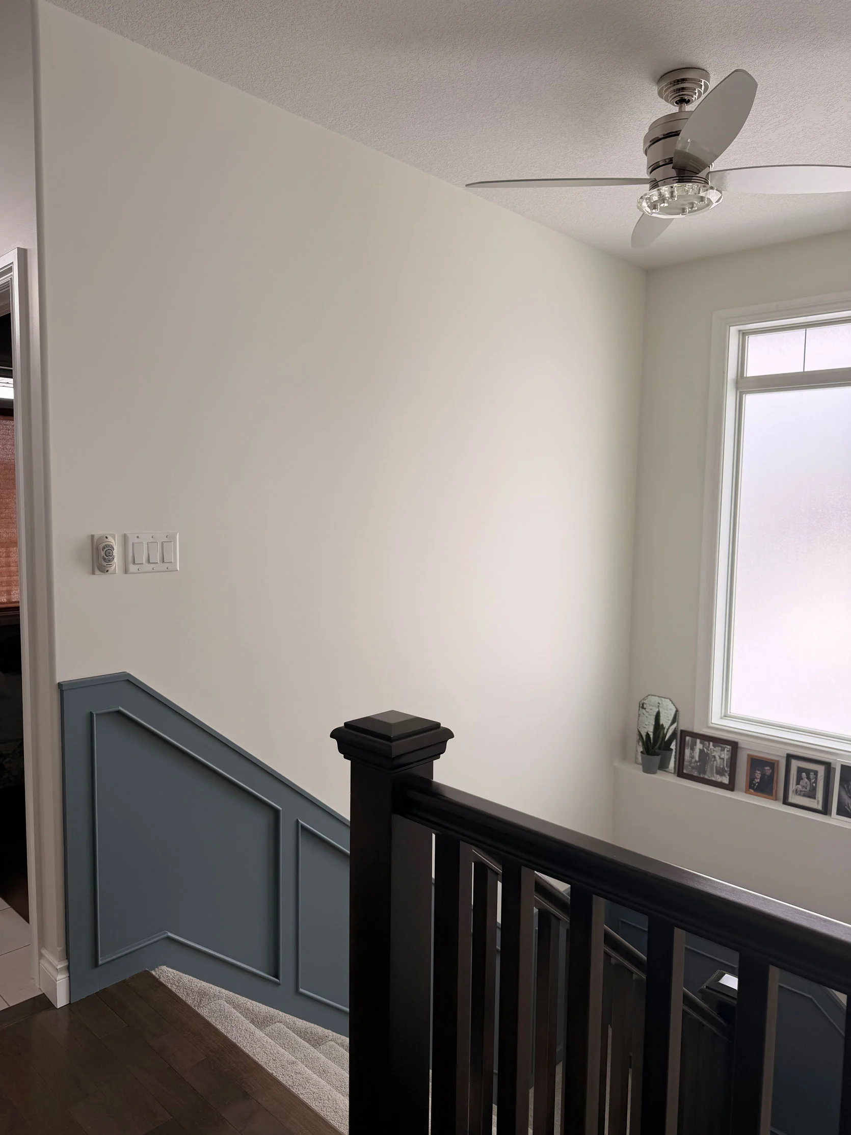
From reader: I have a large staircase heading downstairs. The space is big and overwhelming. How best to style it?
My quick style swaps: Quick and concise, Lyne B., I appreciate it. While I can’t really tell much of Lyne’s style from the photos of her upstairs staircase landing, and she didn’t really give me much else to work with from her submittal, I’m going to make some leaps based on the paneling, the color of the paneling, the tiny little family photos and the style of the banister: Lyne likes tradition with a clean, contemporary twist. More craftsman than Victorian. My take:
- Immediately, I wondered why there was a fan here with LED lights, so my first change would be to take that out and do a gorgeous pendant light in a milk glass.
- Take advantage of all that vertical wall space and really bring it to life with a wallpaper. Not the easiest installation given the space, but not too big a hurdle to jump for the style payoff, I think.
- Take all those little frames and do more with them. Plus, keep adding those family photos! Line them along the window for something funky, or leave them down on the ledge. Bring more and larger pictures in an organic grouping down the left side of the stair wall.
- Pop in a sconce (it doesn’t even have to be hardwired if you use battery-operated bulbs) for more lighting but also to break up the frames.
- Make that window more of a star! I was going to go all in with a colorful and patterned stained glass film, but played it safe with this leaded glass version, which still looks phenomenal and provides privacy.
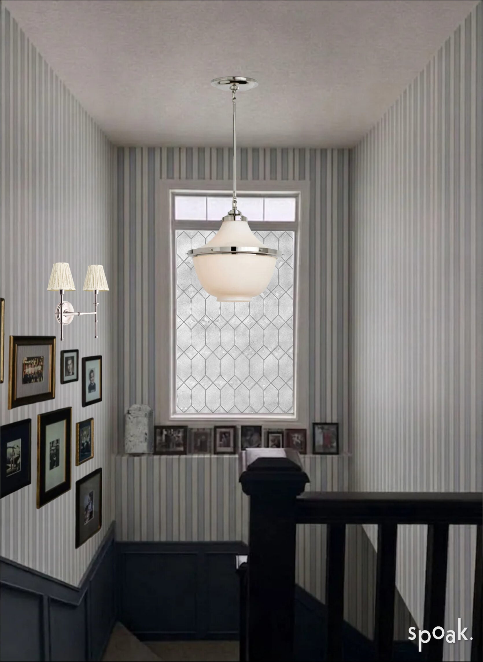
I popped my product picks into Spoak and WOW it’s such a big difference, don’t you think? What was a barren pass-through space is now a cozy, memorable family time capsule of photos, and traditional but not frumpy design details.
I preferred the polished nickel finish on the lighting to play into the “leaded glass” lines of the window film, but a warm antique brass would also be gorgeous here. Lyne can, of course, bring in some of that warmth through gilded and wood frames. She shouldn’t be afraid to mix and match the mats inside the frames in navy, taupe, white, and maybe even some patterns, too! The wallpaper is from Chasing Paper and comes in a ton of other colors, but I thought this tonal blue would work beautifully with the color of the paneling.
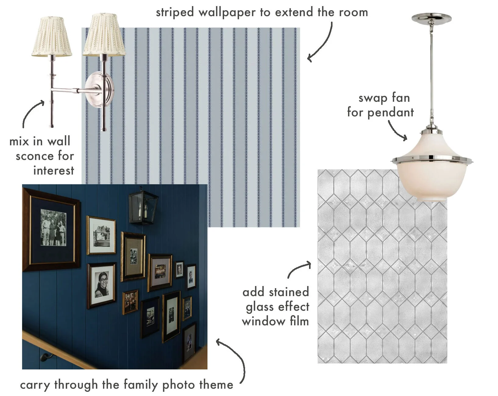
Wall Sconce | Wallpaper | Pendant Light | Stained Glass Window Film | Framed Gallery Wall
The Almost-There Living Room
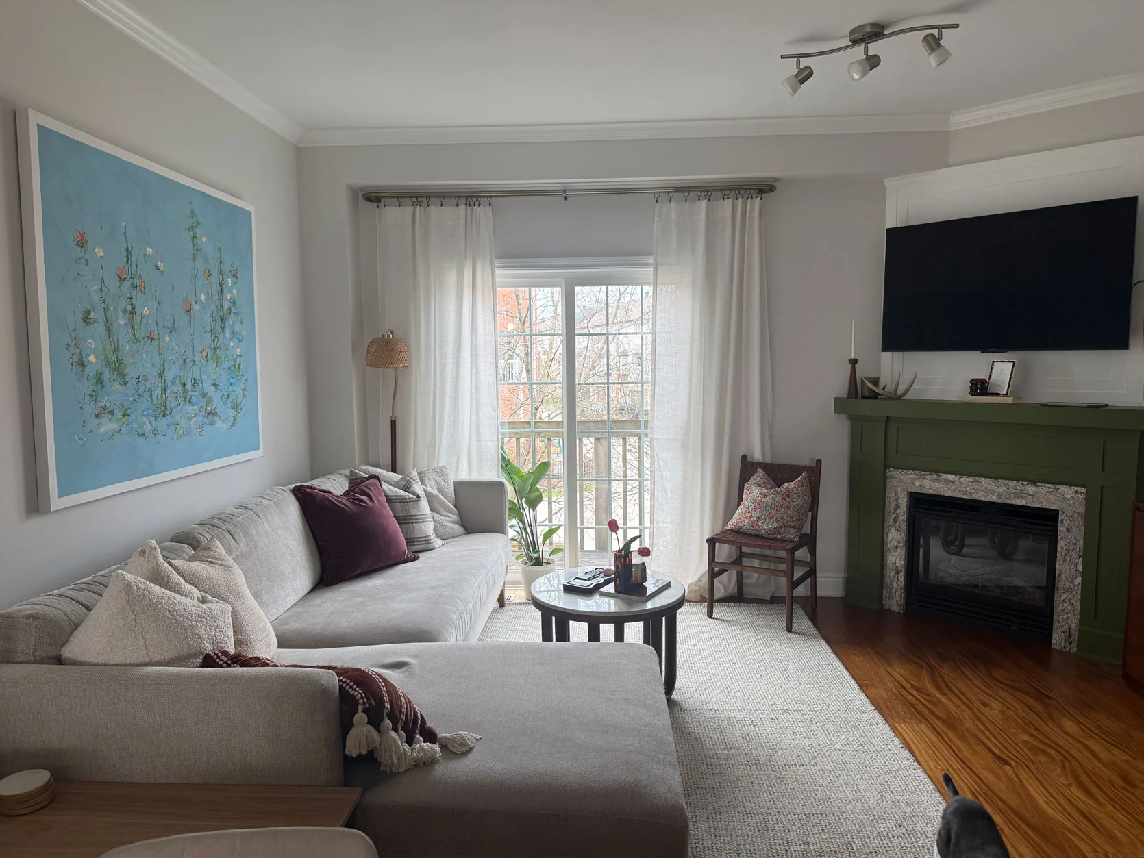
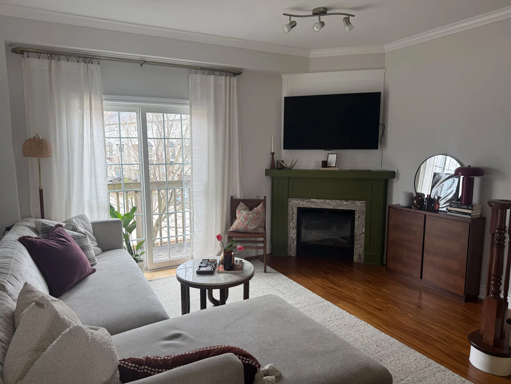
From reader: My problem area is my living room! I would love some styling / quick fixes advice. Just a few notes (if permitted):
- Very unsure about how to style my surfaces and L-shaped couch.
- I love the painting above the couch, and I love the green fireplace. I just don’t know if I love them together in the same room… I’d love to make it work if possible, but if not, I’m open to painting the fireplace a different colour.
- My curtain rod is a double curtain rod, and I currently have these light linen curtains, but would love to get a second curtain for the exterior rod…
- I’ll definitely be switching out the light fixture in the near future
- Also open to changing the tile surrounding the fireplace!
My quick style swaps: Thanks, Maria A., for trusting us (me) with opinions on your living room. You know how vulnerable you have to be to send someone a photo of YOUR HOME and say “tell me what to do better”?? It’s hard. Anyway, Maria, your living room is so charming already! I can see why you’re struggling with the art and the fireplace—there’s nothing else in the room that really speaks to them, so here’s what I suggest:
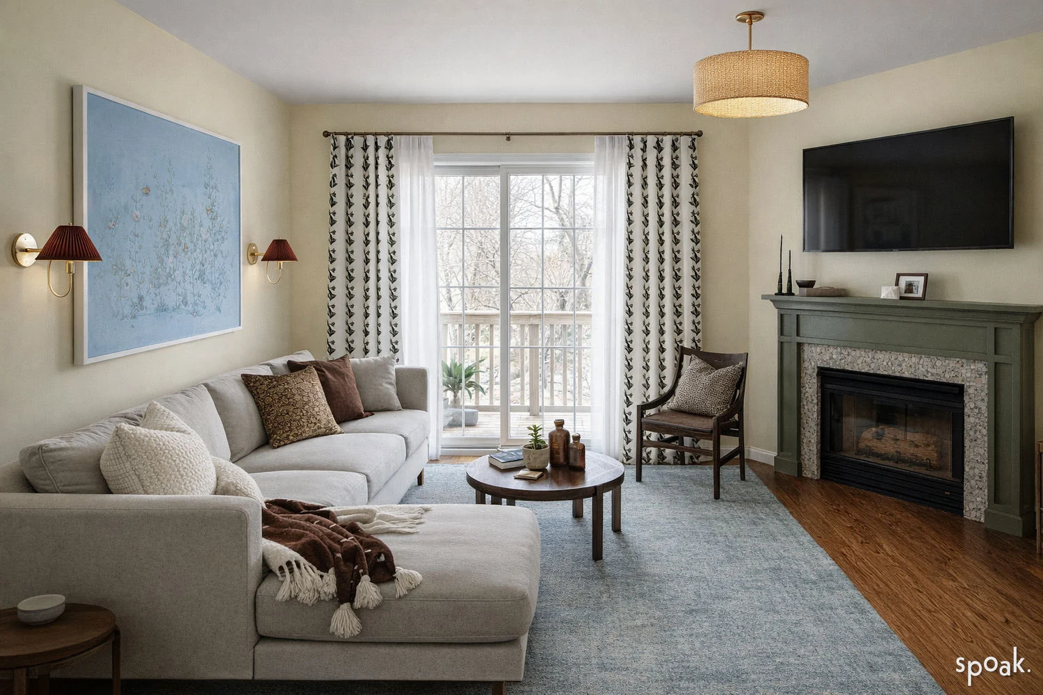
- Bring more of the painting into the room! If you want to and are interested, I’d swap out the rug. It’s a lot of gray happening between the sectional, rug, and walls, and it’s making the fireplace and art feel a bit forced into the room. Go with a soft solid blue or even a light olive green.
- Have some fun with the front layer of curtains if you add some more panels. A print would introduce so much character and make the large botanical canvas feel more at home.
- Keep the green fireplace surround and even the stone tile as-is to keep cost and effort low, but bring that warm-toned green into other areas! A pillow and/or a throw could be enough.
- Lighting = character! Texture in a flushmount would go far and wide for introducing some personality (you need a tight ceiling light so it doesn’t get in the way of the TV line of sight). And I’d even add some sconces flanking the art canvas to make it even more special.
- As for some of the other surfaces, I’d keep the styling minimal. Leave the fireplace mantel bare or just with a set of taper holders, and on the console table, hang the mirror, put the lamp directly on the table surface, and then move two of the vases atop the stack of books. Easy, peasy.
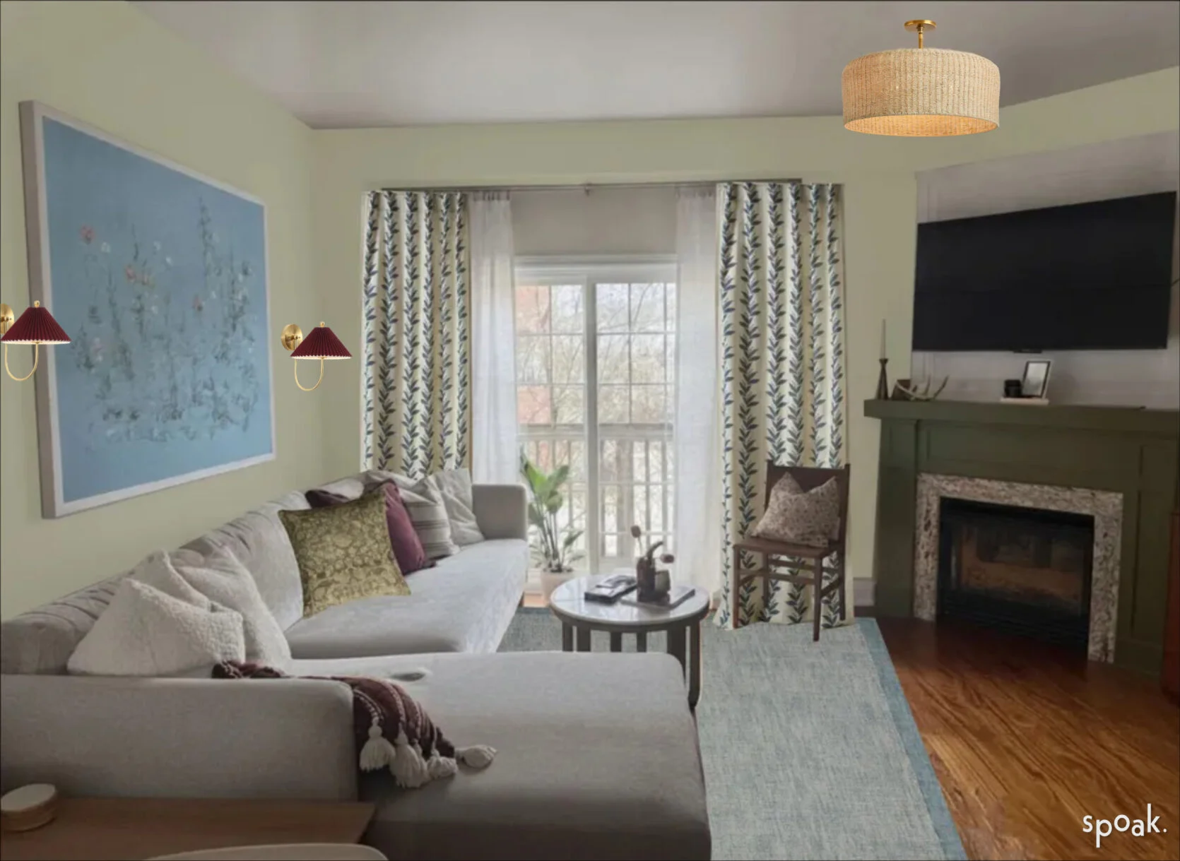
Above is the plop-and-drop model from Spoak, and below, I did a little Spoak magic just to see it come to life some more. The rendering isn’t perfect, but what it did accomplish is showing more of the feeling of my changes. Just more lived in!
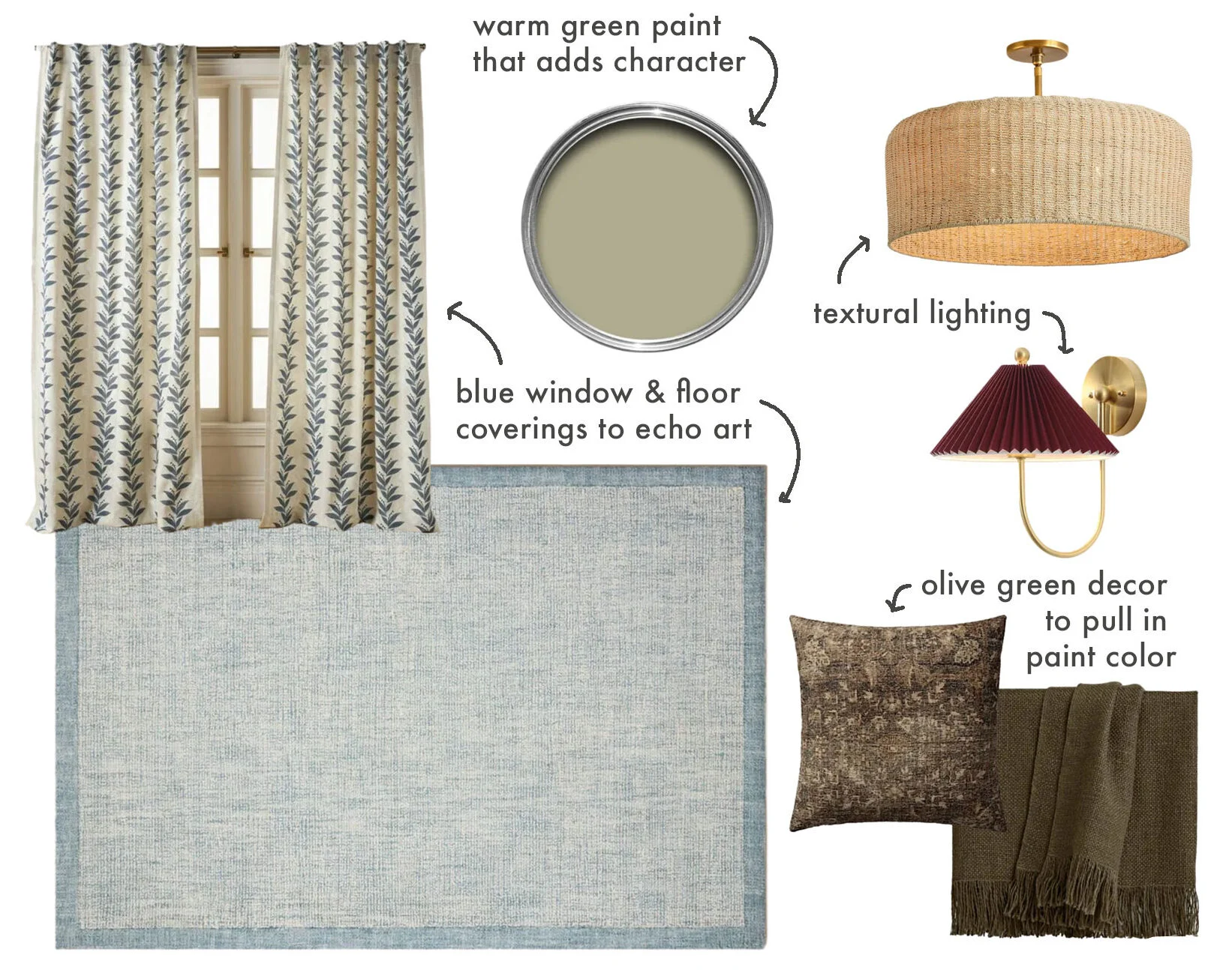
Curtains | Rug | Wall Color | Ceiling Light | Wall Sconce | Throw Pillow | Throw Blanket
The Non-Mudroom Drop Zone
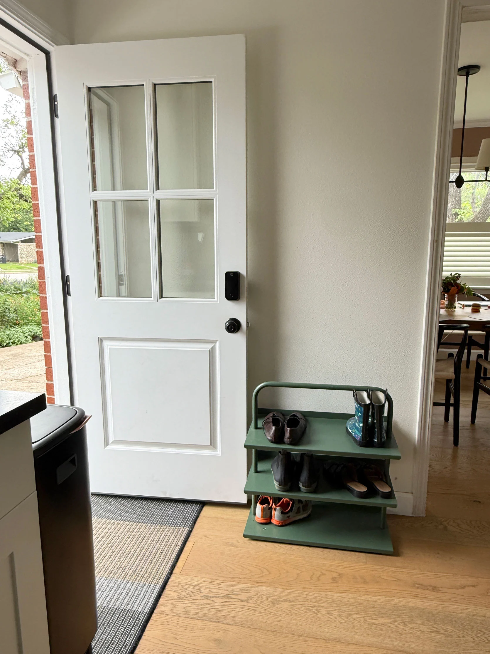
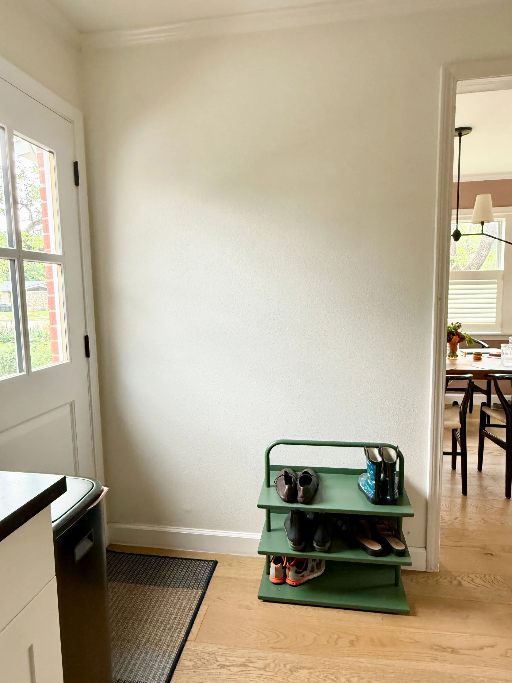
From reader: Our house’s exterior side door, which leads directly to the driveway from our kitchen, is our main family entrance when we get home. We don’t have space for a proper mudroom, so it’s also become a de facto drop zone/pile of shoes/mess I’m cleaning up on the daily. We have two kids under 5, and we anticipate this area becoming even more hectic as they both start school and all the sports. Would love some ideas on how to style this space vertically to maximize storage and conceal clutter. A built-in would be amazing but probably too big-budget for us right now. When our door is wide open, the available wall space is 30″ wide (not including an additional 2″ of trim). Floor-to-ceiling height is 8′.
My quick style swaps: A mom in need! Say less! This one is tricky, but there isn’t a ton of room to work with, and it needs to serve a host of purposes in a compact footprint. Here’s my fast assessment:
- Get mudroom vibes on a muuuuuch smaller budget with some affordable beadboard panels (seriously, like under $100 all in here), topped with peg rails. These will hold backpacks, umbrellas, tote bags, grocery store reusable bags, dog leashes (if they have one), etc. Yes, it can get bulked up quickly, so I’d reserve this solely for the few things you need to grab right out the door. Not as a second closet.
- Closed shoe storage is going to limit the visual clutter. There aren’t many options in that 30-inch range, but it’s not impossible! Better yet, if that cabinet has a surface on top to hold a bowl for keys, sunglasses, and a little decor fun.
- I’m not sure if there is any lighting in this spot, so in case there’s a j-box up there I’m not seeing, I popped in a gorgeous flushmount to add some style.
- Again, I don’t know much about this reader’s style, or even the limitations of the room beyond, but I love a wallpaper above a 3/4 height paneling moment.
- If the clearance under the door can handle it, I’d add in a rug both for style, dimension and color, but also just functionality. Something washable is always best, though something wool will always be able to take a beating.
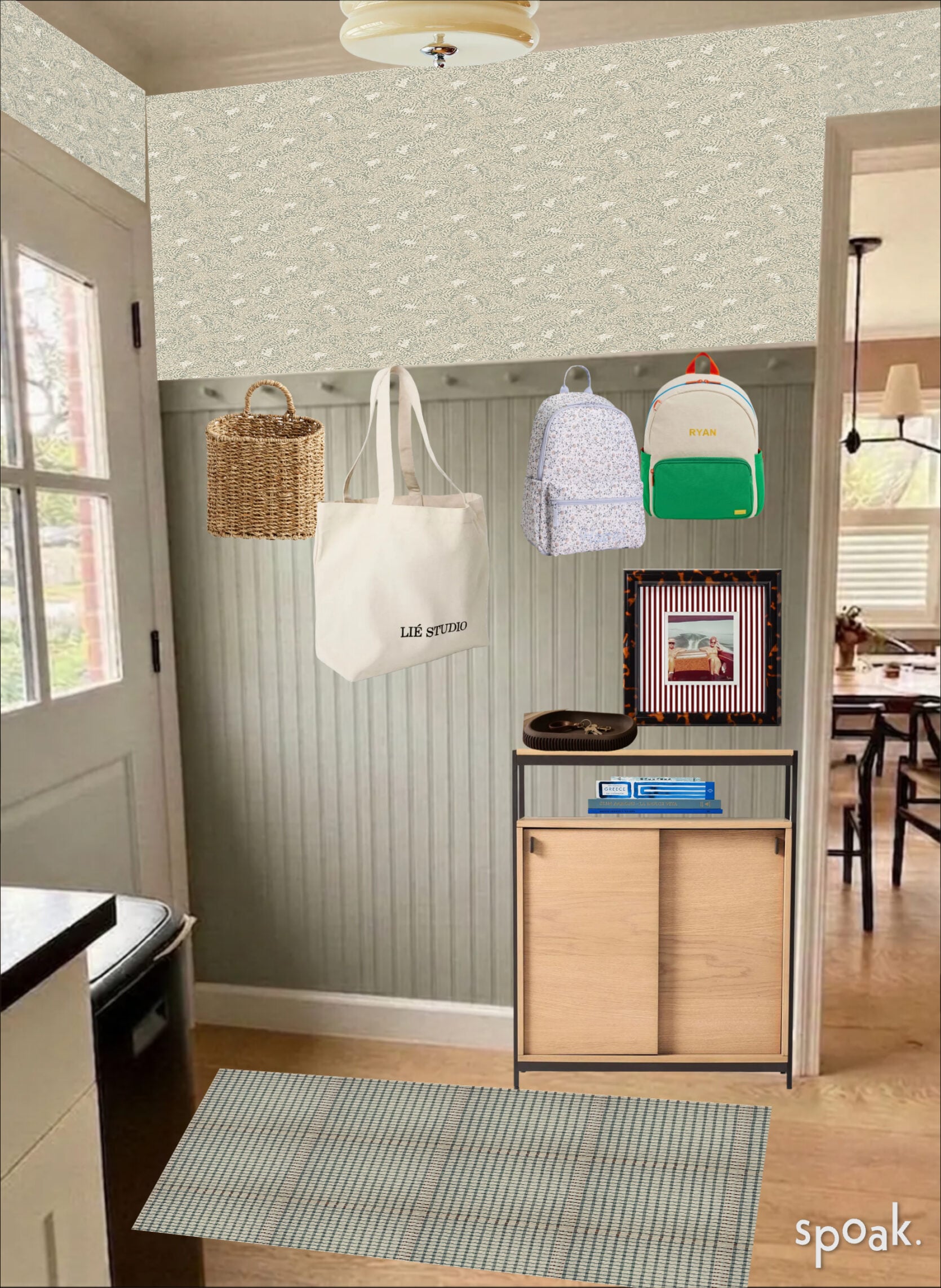
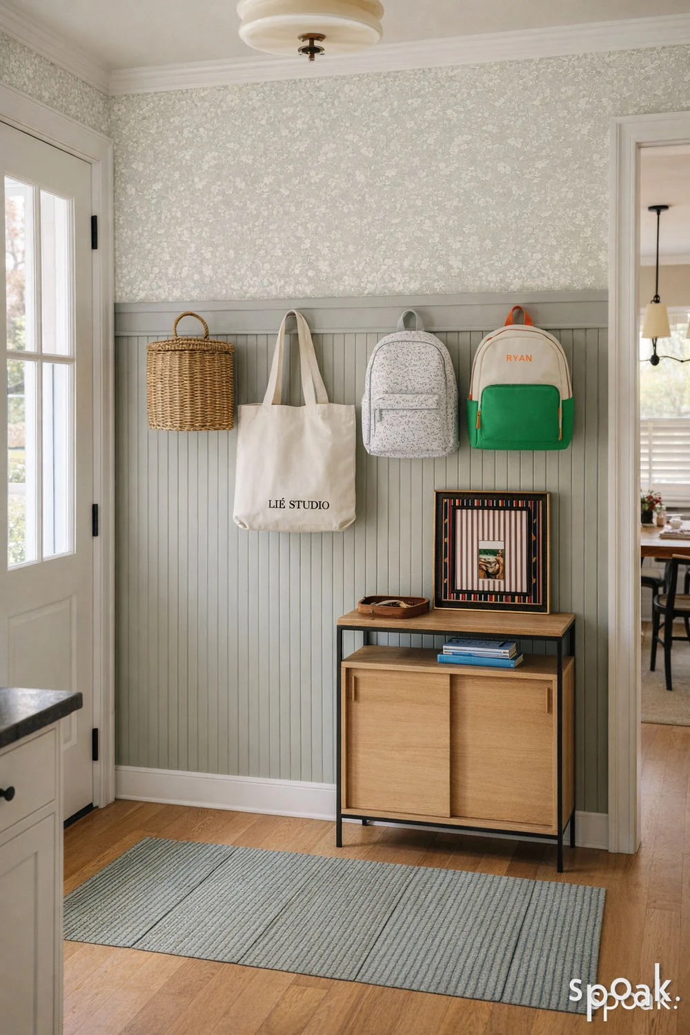
Above, I’m showing you both the more rough-draft room board alongside the Spoak rendering. It’s not exactly right in terms of the rug, the wallpaper, or details, but it sure does look so soft and inviting to me. I love that flushmount so much; it’s on my personal moodboard for my downstairs landing zone, which is similar to this reader’s. A framed piece of art or family photo adds some personality. I stuck with a safe sagey green because I don’t know what else is happening in that house or adjoining kitchen; if it was my own room, I’d probably go more bold with a deep blood red or eggplant! There is such beautiful sunlight in here; it could really handle any color beautifully.
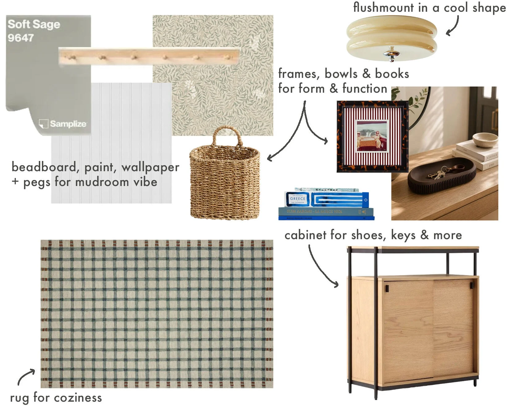
Paneling Paint color | Beadboard Panel | Peg Rail | Wallpaper | Rug | Wicker Basket | Flushmount | Frame | Key Bowl | Books | Storage Cabinet
—
This is where I leave you for today. That was fun, and now I’m itching to go and make at least one problem area in my home better. It’s amazing what a little shuffling around, or painting, or lighting swaps can do to elevate a simple room. Even a 30-inch wall, or a stairwell, or a compact living room. A small space deserves love, respect, and thought, just as a larger space does. Hopefully, I did these justice and helped out three readers today. They might be aligned exactly with what I picked out in terms of style—that’s fine, I have no clue what they like!—but if they applied some of the principles, they’d almost certainly get to a result they felt much better about.
Until next time, friends…
Opening Image Credits: Design by Max Humphrey | Styled by Kate Webb of Rodeo Queen and Colleen Mote | Photo by Kaitlin Green | From: The Most Magical (And Rentable) Retreat That My Best Friends Created: The Carly Tour