Back For More-lando: Construction Is Well Underway At Chad’s! Here’s What His Spanish Bungalow Renovation Currently Looks Like

Hi! I’m back to talk to you more about the fun renovation I’m helping my friend Chad with! It’s fun for me, because I’m not in charge of managing construction. It’s been slightly more work for Chad, as he’s been living on site (in the recently renovated ADU). There have definitely been a few hiccups along the way, but the project is nearing completion and I can tell that’s a huge relief to my friend. I want to chat with you about what we have planned for the house and give you a preview of some of the materials we plan to use in the house. And give you some sneak peeks of construction so far (lots of pretty progress pics!).


It’s summer, so here’s me and Chad driving around and being bikini babes at Buck Pool Party in LA.
Like me, Chad is very house obsessed. And like me, he had to do a lot of complicated strategizing to get himself into home ownership. Today, I plan to chat about how we’re maximizing space on his property while maintaining the charming vibe of the original structure. But I’d also like to chat about the why of the whole situation because we’re no longer living in an age where we all grow up and buy houses in the city we want to live in. That option is pretty much reserved for the super rich, especially in a place like Los Angeles.
I feel really lucky to own a house, but it also came with a lot of caveats. For me, home ownership meant buying outside of the city where I live. It also meant renting my house out as a vacation rental. I’m gonna be honest, when I was fantasizing about home ownership, I never really fantasized about having to rent my house out to strangers to get by. But in this economy, I’ll take it! Chad was in a similar boat with his house. He had a few goals for it. First and foremost getting himself into home ownership. Second, he wanted a place he could grow into, the option for his boyfriend to move in at some point, space for out of town guests to stay, and room for a roommate (to help pay the mortgage). Chad is a lot better at math than I am, and he spent a ton of time working on the budget for this project, figuring out how to make it all work, and itemizing everything to figure out where he should save and where he should splurge.

Okay, so here’s the plan! This is roughly what the front of the house looked like when Chad bought it…
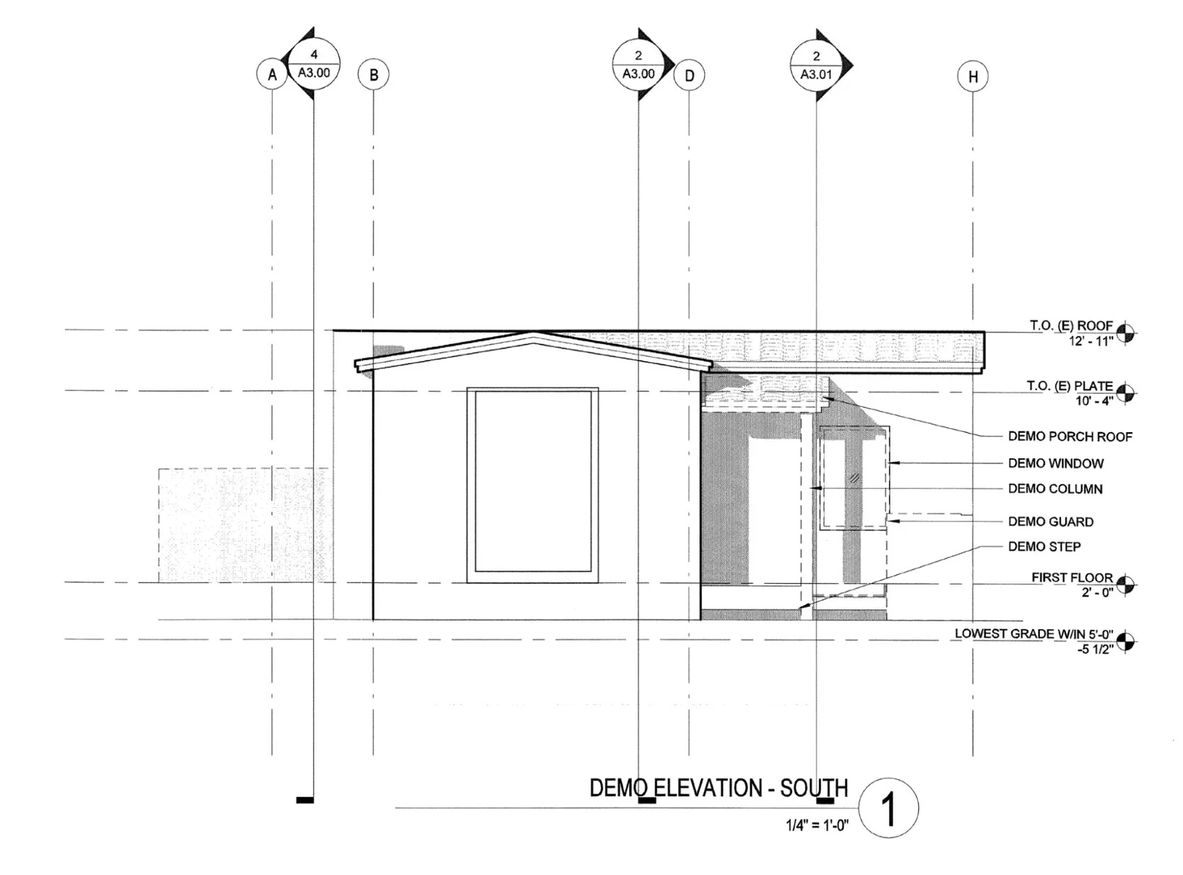
And this is (roughly) what the addition will look like when it’s finished…

These architectural elevations are kinda overwhelming to look at, but the basic gist is that we’re adding a second story to the house. Now, I know what you’re thinking because we actually thought the same thing.
“Please don’t take this charming bungalow and make it into a giant disgusting McMansion!”
Basically, the goal with this whole project was to figure out how to add square footage to this tiny house without making it look like a giant box haphazardly placed onto a small lot. My old LA neighborhood was filled with large, flavorless houses that stretched to the property lines on all sides. I’m glad the modern box trend seems to be dying down, because for years developers in LA have been tearing down charming bungalows and replacing them with giant white boxy houses made out of cheap, bland materials.
Not all home additions are bad, however. What I started to notice in my old neighborhood was that the most successful additions tended to have a few things in common. When it comes to creating a successful add-on to your home, it’s important to include The Three S’s: Style, Set Back, and Sumptuous Surfaces. Let’s chat about why these three things matter!
Set Back
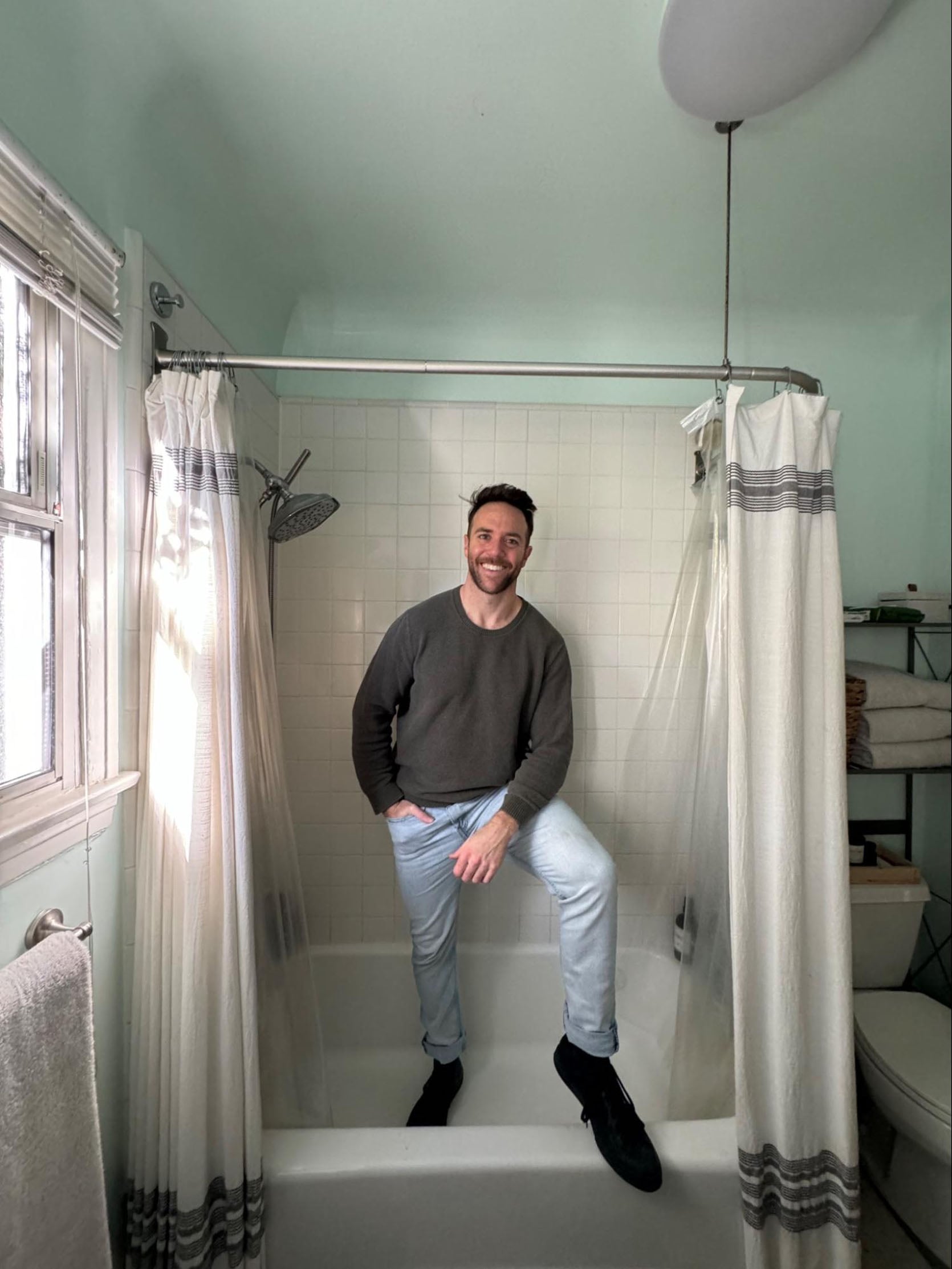
Chad being all cute in the home’s original (and only) bathroom!
Homes that are set back a proper distance from the sidewalk tend to feel more welcoming and airy, whereas those that are too tall, too close to the sidewalk feel cramped and claustrophobic. To keep the charming intimacy of the original dwelling, Chad decided to maintain the original roofline, adding a second story set back. While the building is taller, the second story set back allows more light to filter down. The second floor will feature a primary suite, laundry, an office, and an extra bathroom. In order to make all this fit and keep the front set back, a significant addition is being added to the back of the house.
I like the solution we came up with because it allows the front of the house to remain charming while giving Chad the square footage he needed for his various spatial, financial, and usage goals. The boxier back of the house isn’t really visible from neighboring yards or the sidewalk, so the fact that there is a taller build out in the back doesn’t affect the vibe of the overall property. In the backyard, the additional building height adds to the sense of privacy and coziness.
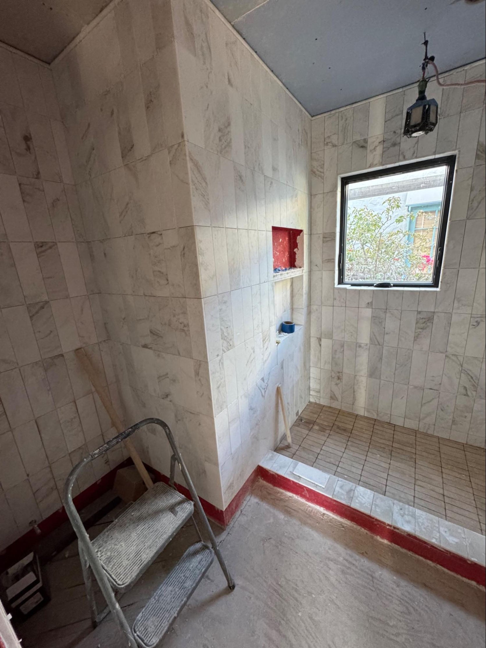
In a way, I think Chad was relieved when construction officially started in 2025. He bought the house in 2022 and immediately started doing a bunch of DIY projects to satisfy his home beautification urges. One of these projects was skim coating the walls throughout the house. I’ve never skim coated anything before so I was wary of him trying this complicated and tedious process, but he tackled the project and was quite successful at it. Now, you might be wondering why Chad spent so much time skim coating walls that eventually were all taken down to the studs. And there’s a couple reasons.
Firstly, it wasn’t clear from the get-go that it would be financially possible to do the upstairs addition. So there was a distinct possibility that the walls he was skim coating might stay. Second, and I related to this quite a bit, if you love houses and move into an ugly one, it’s almost impossible not to want to make it as pretty as you can, as quickly as you can. You’ve just spent your life savings to make an enormous purchase. And you want to reap the benefits of it. At a certain point, however, Chad seemed to be getting the same level of frazzled I was when I was in the depths of DIY updating at Londo Lodge. Remember when I removed 3000 square feet of ugly blue carpet then my knee exploded from repeated impact? I do. I’m so glad that manic period is over!
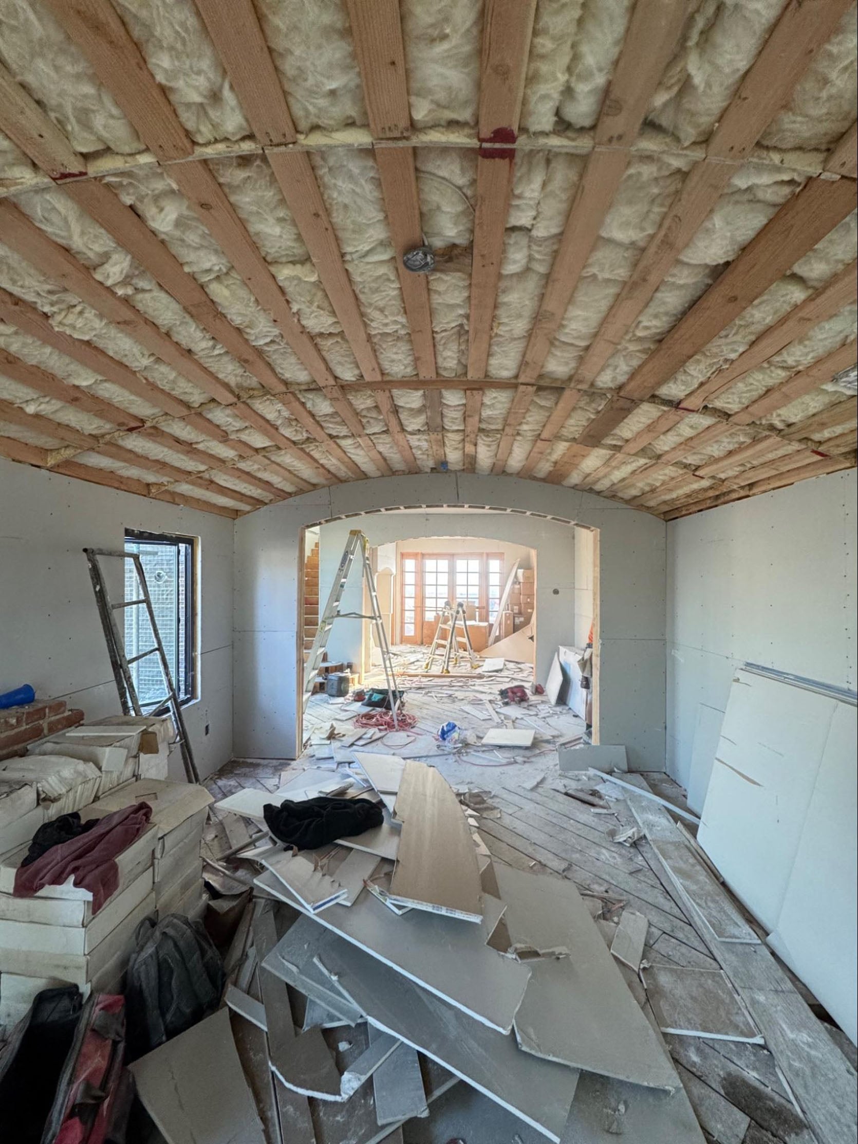
The living room sits at the front of the house and underwent the least changes of any room in the house. The barrel ceiling was almost identical before and there were no plans to redo it, but it had to be rebuilt halfway through the project because when they began removing plaster to do electrical work they found out that – GASP – the plaster was actually holding up the ceiling. That obviously added cost which is a bummer, but at least we can be sure the entire house is perfectly structurally sound now. The new kitchen sits at the back of the house (accessible to the new deck). To tie the spaces together, Chad decided to mirror the original arch in the living room.
Sumptuous Surfaces
Now, let’s talk about how Sumptuous Surfaces can help keep a house from feeling too McMansion-y. The biggest giveaway that a house has been cheaply renovated is materials. Emily talks about this a lot, but windows and doors can make a huge impact on the way a house feels. The cheapest/fastest style to renovate a home into a “clean and modern”. But more often than not, this means flimsy white vinyl windows, a ton of drywall everywhere with no trim, recessed lights, and very little attention to detail or craftsmanship. Our eyes are used to processing this contemporary style as fancy, because it’s new. But it lacks character and gets dated quickly.
I’m not anti-modern, I just think it’s a harder style to do well because when things are minimal EVERY decision matters. Every frame around a window matters. Doors matter. If you’re going minimal design wise it often helps to elevate the space with richer materials (which ends up costing as much as a more historic renovation). For Chad’s house, we wanted to stay within the confines of traditional Spanish Revival style, while adding a bunch of contemporary flourishes that made the house feel more like Chad. Over time, I’ve become more of an architectural traditionalist while Chad likes things more modern/contemporary.
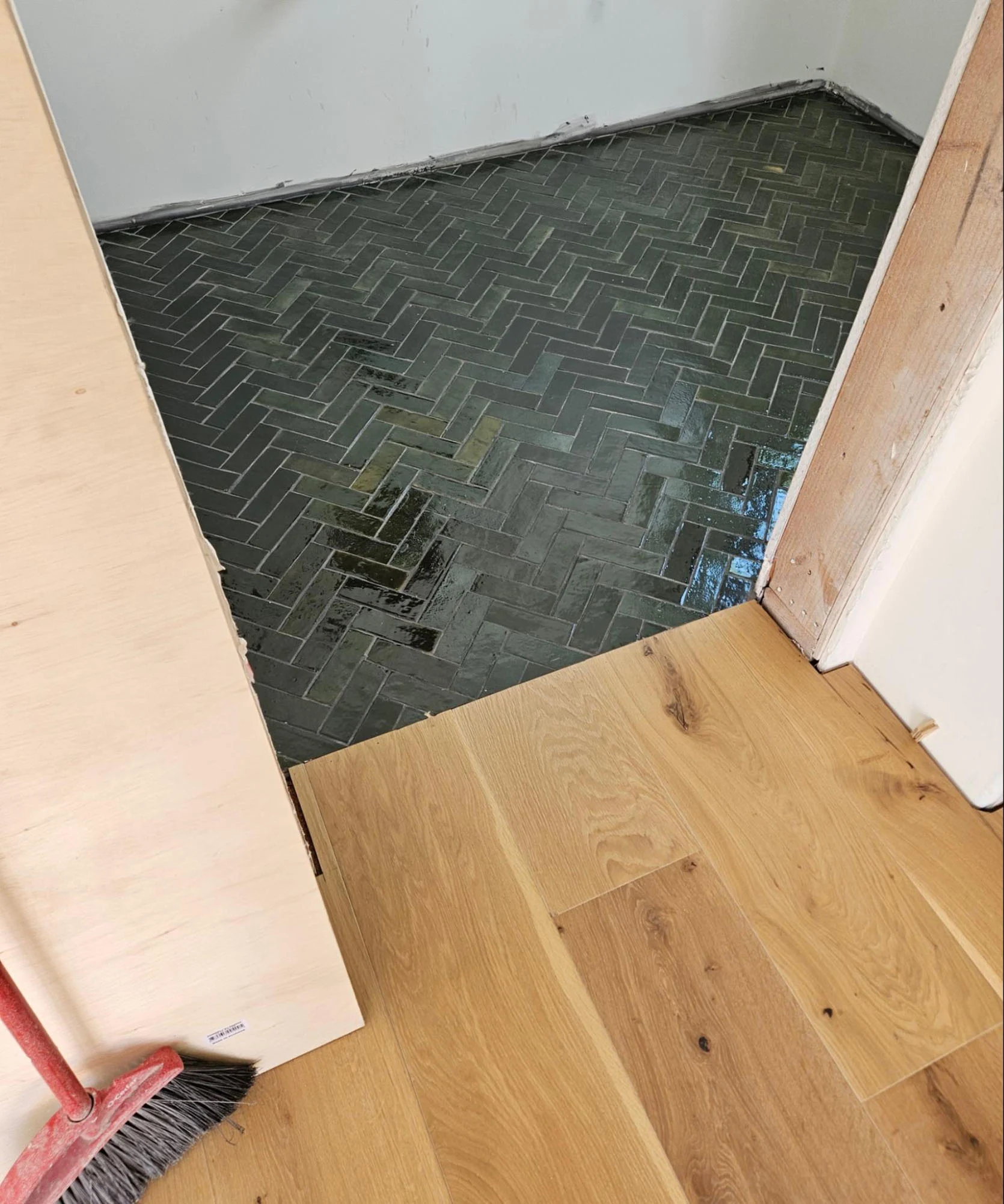
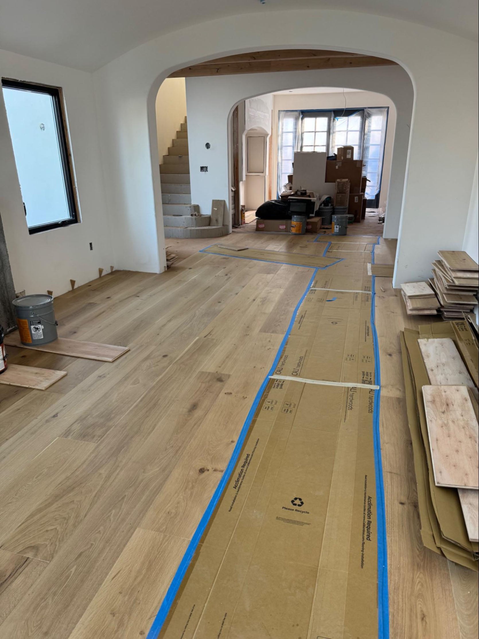
One of the first material selections we made was the floor. The engineered hardwood we selected is this gorgeous wide plank hardwood from Cali Flooring. Choosing flooring can be challenging because it’s hard to see exactly what color it is from looking online. The stain on this one seemed like it might be a bit too beachy and light for a Spanish home, which typically have darker, moodier, richer floor stains. However, once we saw it in place we really loved that it was rustic, earthy, and a great medium tone for wood. The flooring has been installed for a while now, though it’s covered with ram board (construction cardboard) so we haven’t been able to look at it for a while.
Style
This relates a bit to the surfaces conversation, but Style obviously has a huge impact on whether a house feels like a generic renovation or a thoughtfully designed home. We’ve been having a bit of a hard time naming the style we ended up going with (maybe you can help when we finally reveal the home!) but it’s a combination of Spanish Revival and Contemporary. Spanish Organic Modernism maybe?
Chad wanted to make sure his house had a perspective, which of course comes through in the materials we chose, but also in the design of the house. Arches are very ‘at home’ in a Spanish house, so we added an arched front door as well as a few arches around the property. Chad also wanted to play with the drywall edge to make it a bit more interesting, so he selected a more rounded, arguably more Spanish/adobe edging around doorways and corners. I was a bit apprehensive about the style to begin with, as it was popular in early 2000s tract houses, but everything old is new again and it pairs nicely with the style of the house so I love it.
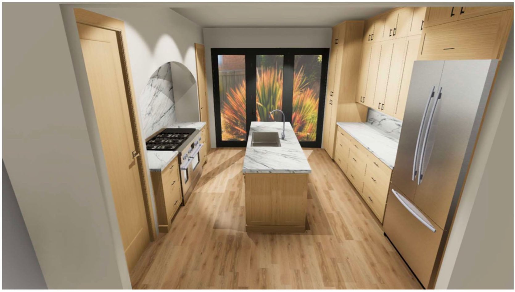
The kitchen is almost done now, but I do love a rendering moment so here’s an early rendering showing the basic plan for the kitchen. And here’s what it looks like in real life…
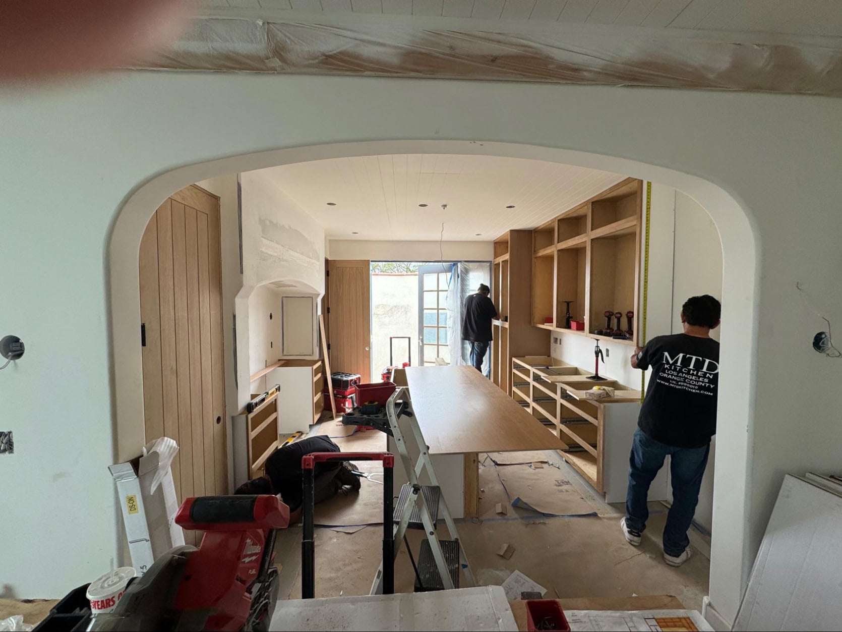
The plan for this room has been updated a bit. Chad actually ended up getting the same pretty AGA range Emily has (!!!) and the countertop he chose is a really pretty green. I guess in general the tip here is to find ways to add character, dimension, and flavor to your renovation without trying to make every single thing a “moment.” So while there are interesting tile, lighting, and hardware selections throughout the house, there are also quiet design decisions as well. The walls in the main spaces are mostly neutral (though we did go kinda wild with color in the bedrooms). Light fixtures are interesting but also simple and elegant. In design, it’s important to have focal moments and quiet moments and I think we did a good job balancing them in this project.
And now, for some preview pics!

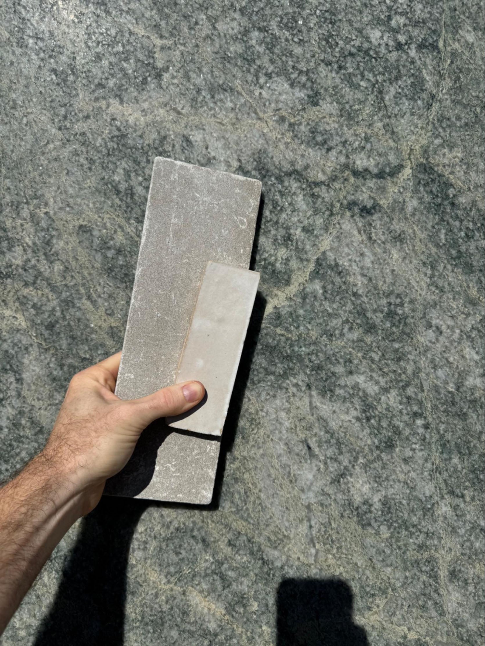
Chad realizing the fixture he got for his bedroom was too big. We’ve all been there! And here’s that pretty green stone and some tile selects.
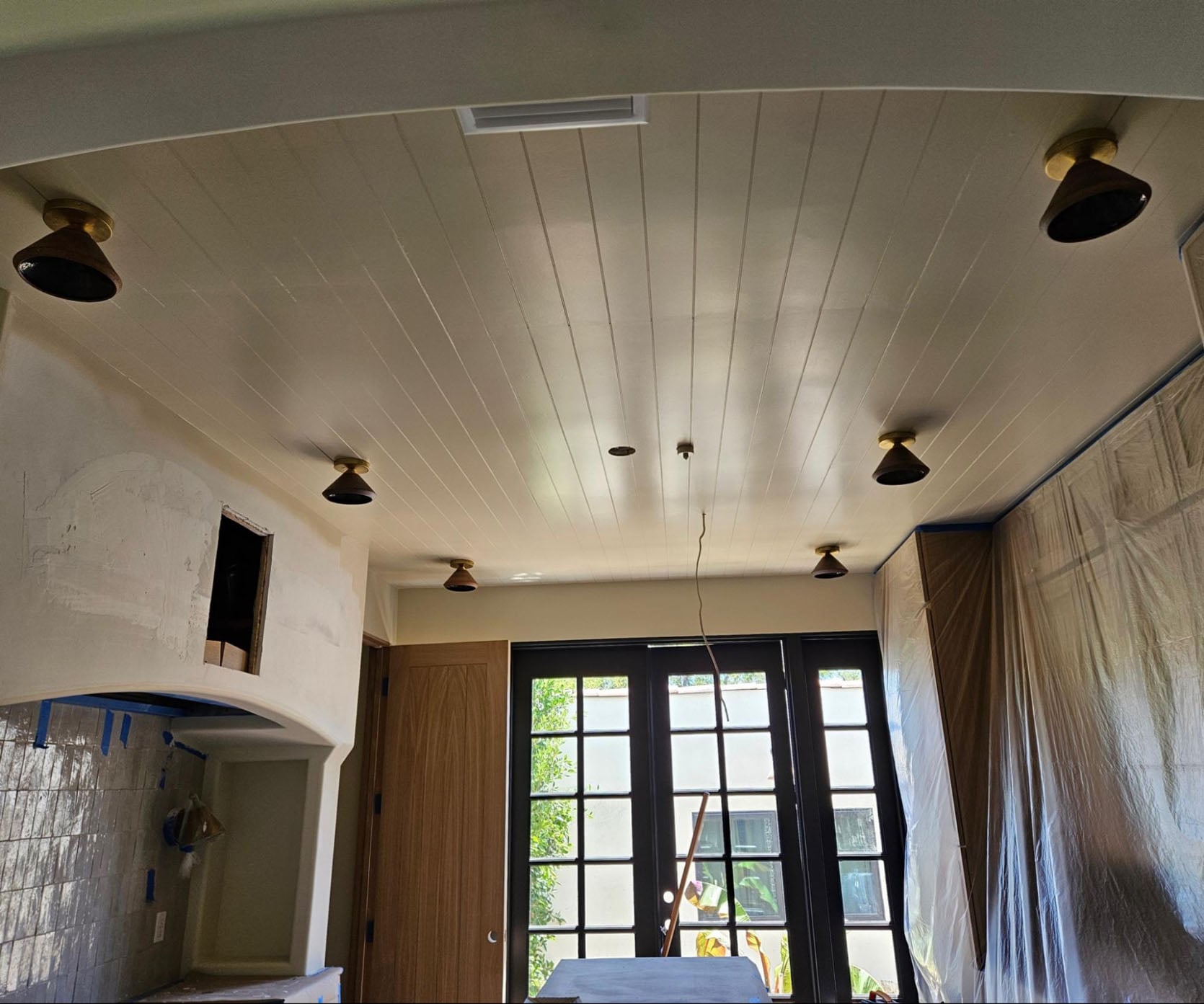
We added paneling to the ceiling in much of the house. It made a much bigger impact than anticipated!
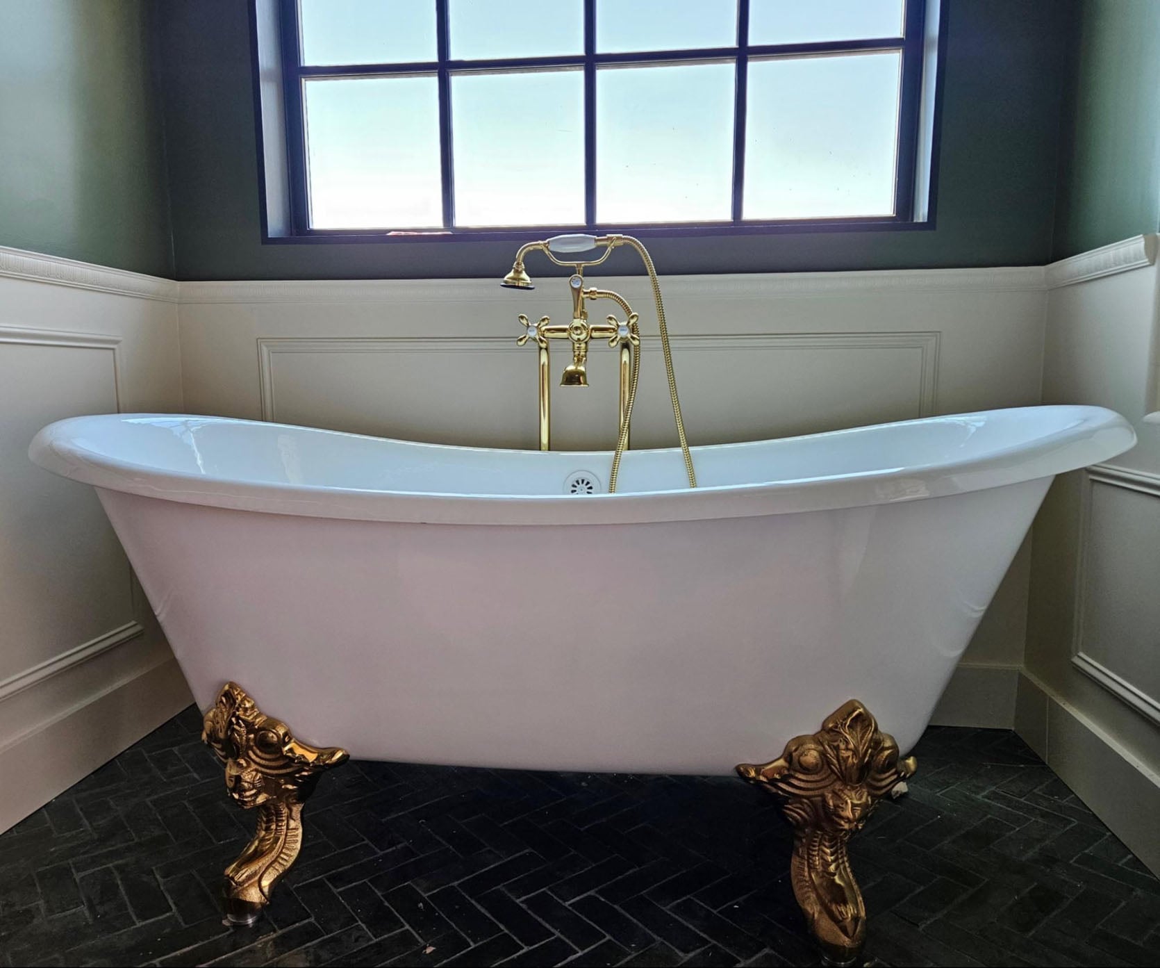
One of Chad’s goals for his primary suite was that it make him feel like a glamorous Hollywood starlet from the 1920s. Goal achieved!
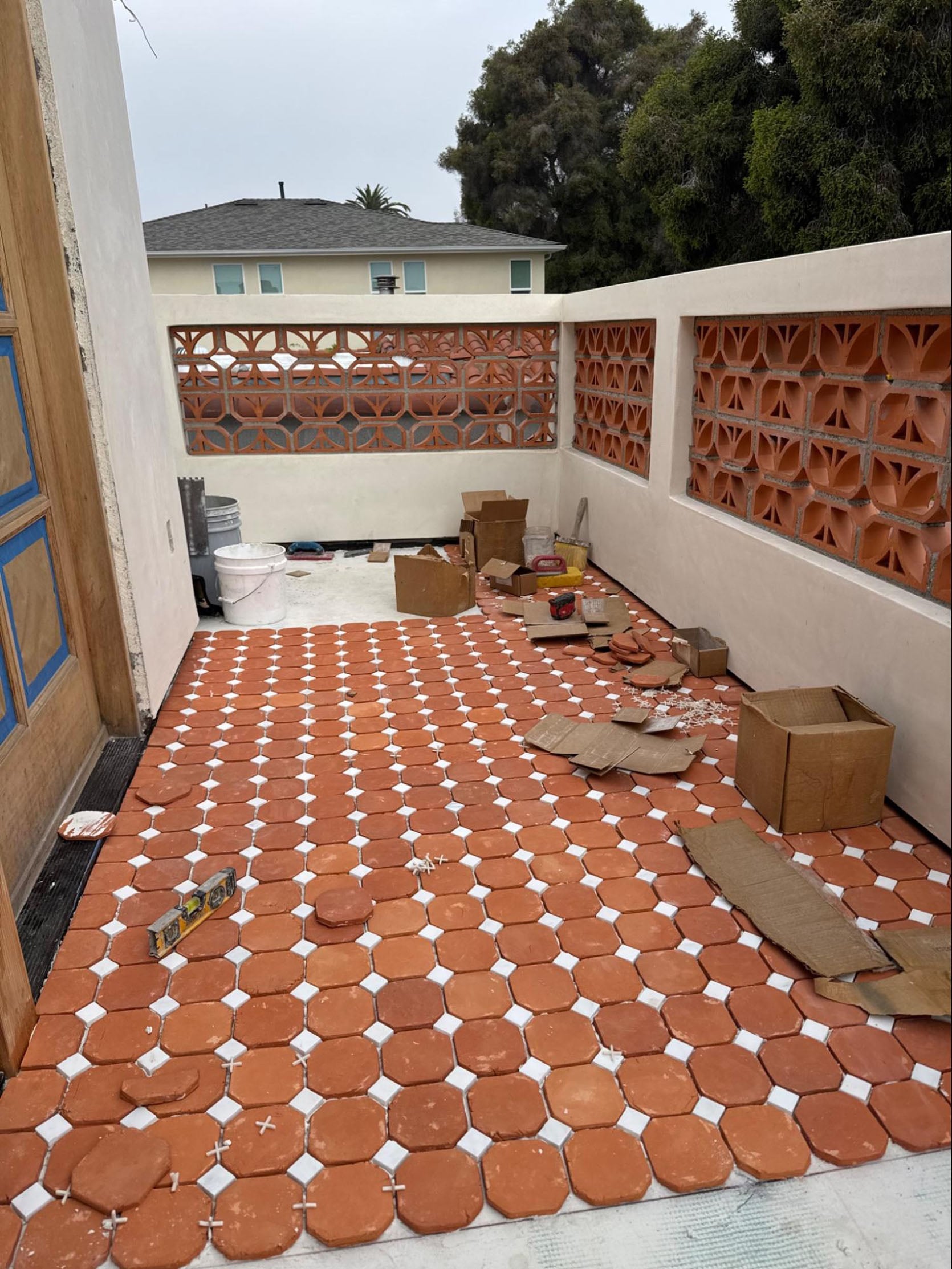
The terrace off the primary bedroom.
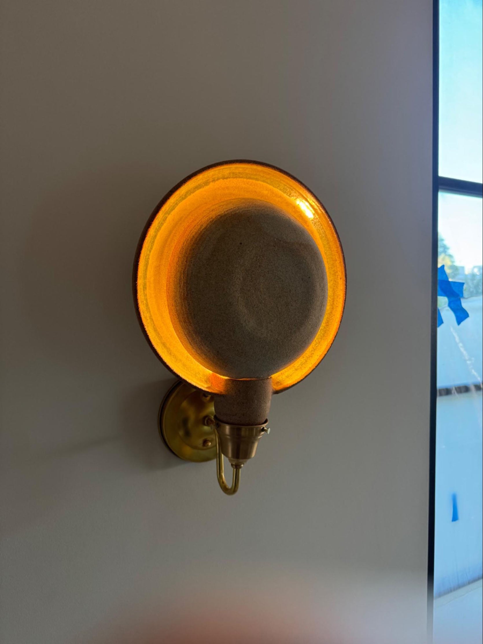
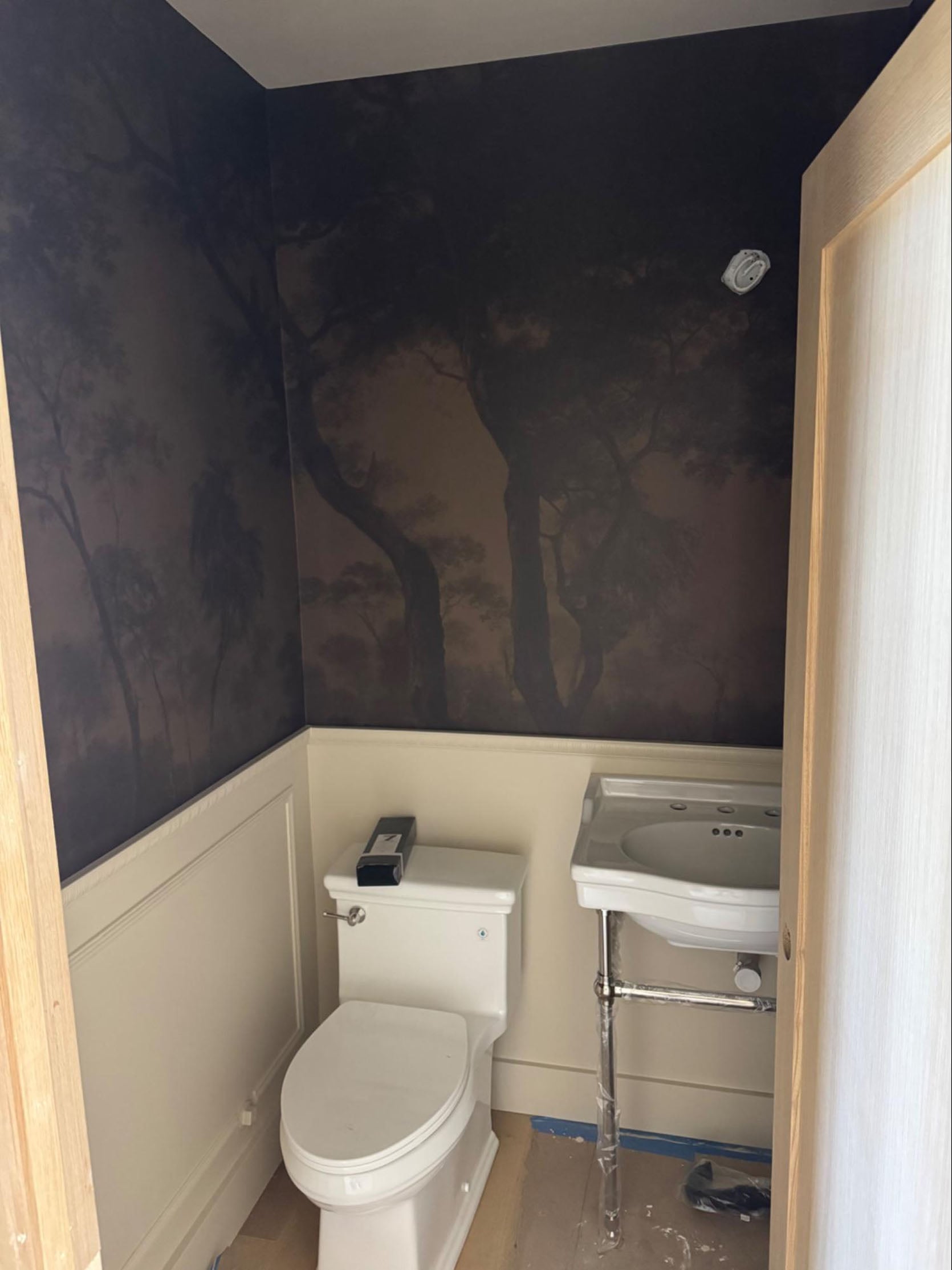
In addition to having a real job and renovating his house, Chad also makes pottery (he’s @panicceramic on IG). He designed and made a lot of the lighting throughout the house! And on the right, some mysterious woodsy wallpaper in the upstairs guest bath.
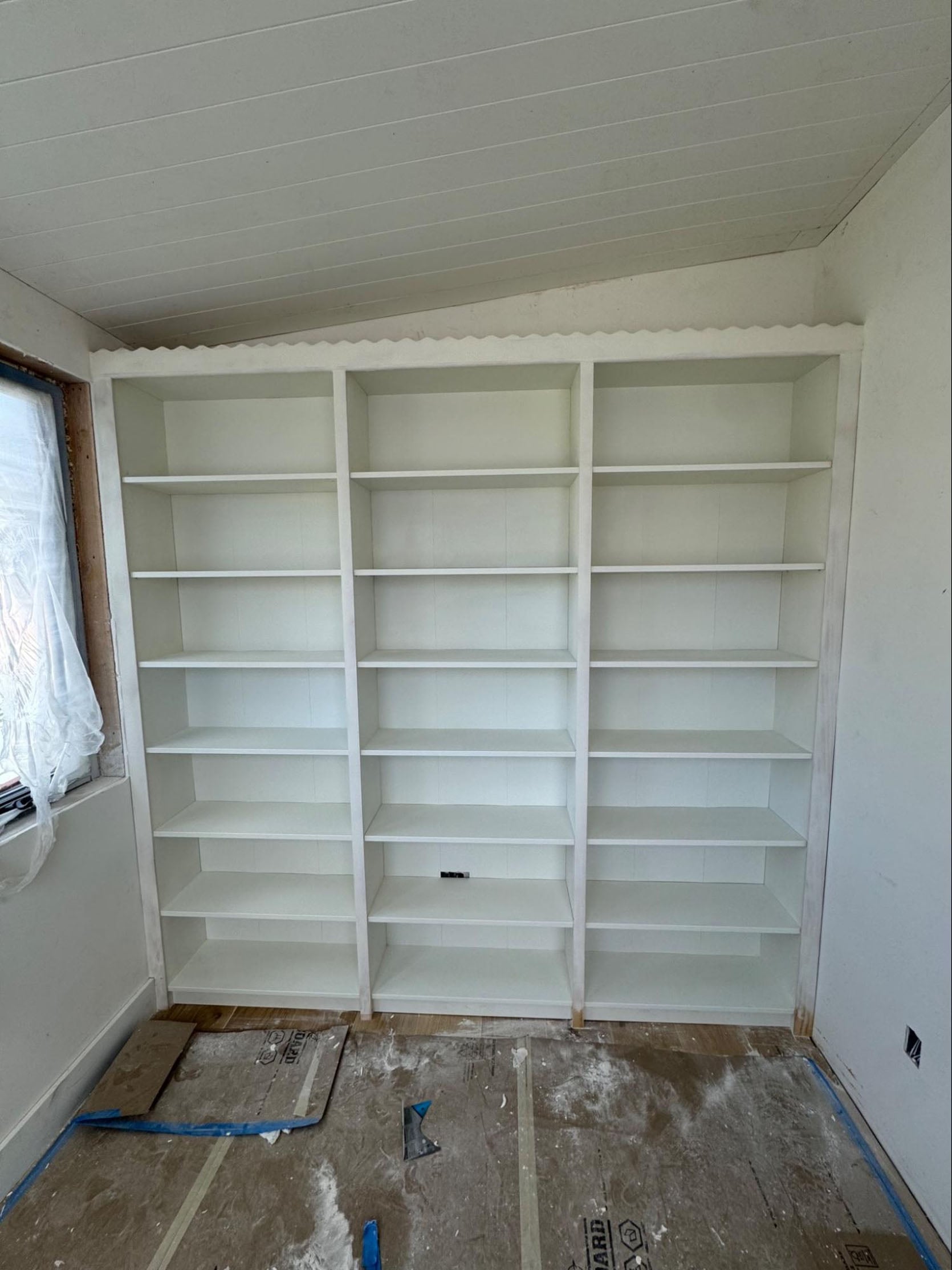
Chad did a DIY shelf in his office to save on custom cabinetry.
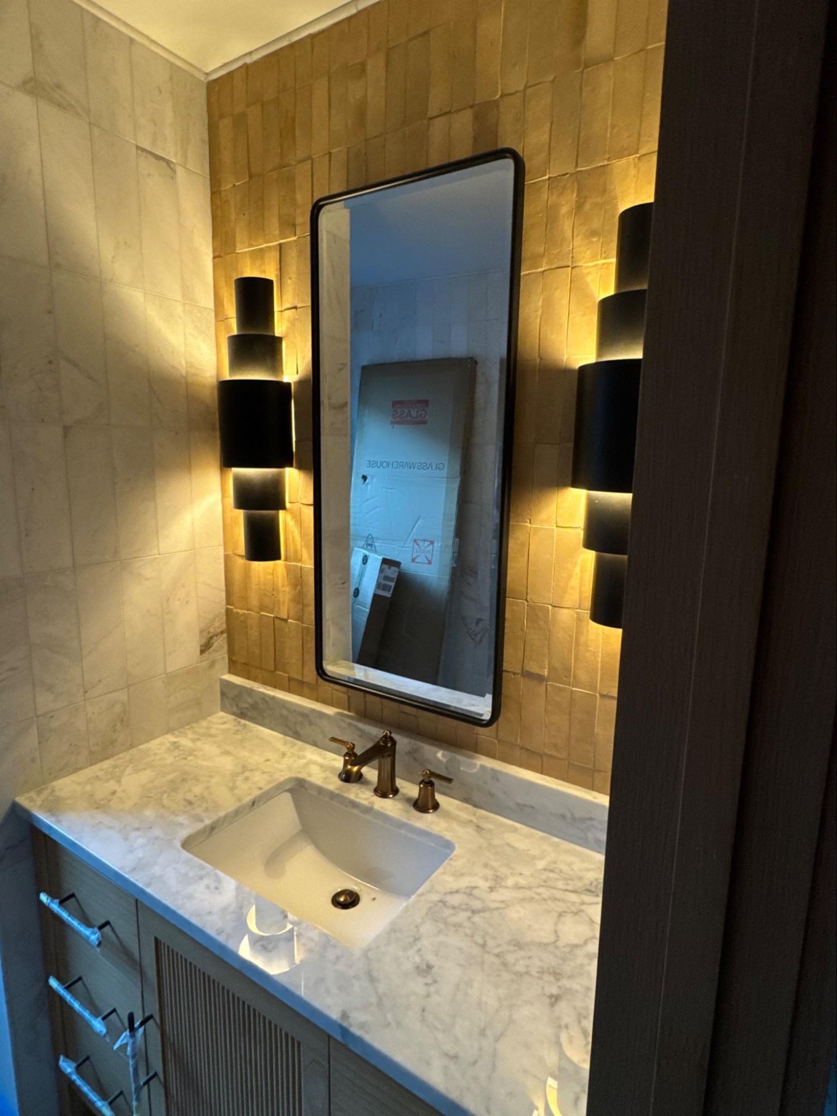
A fancy vanity moment… BUT IN WHICH BATHROOM???
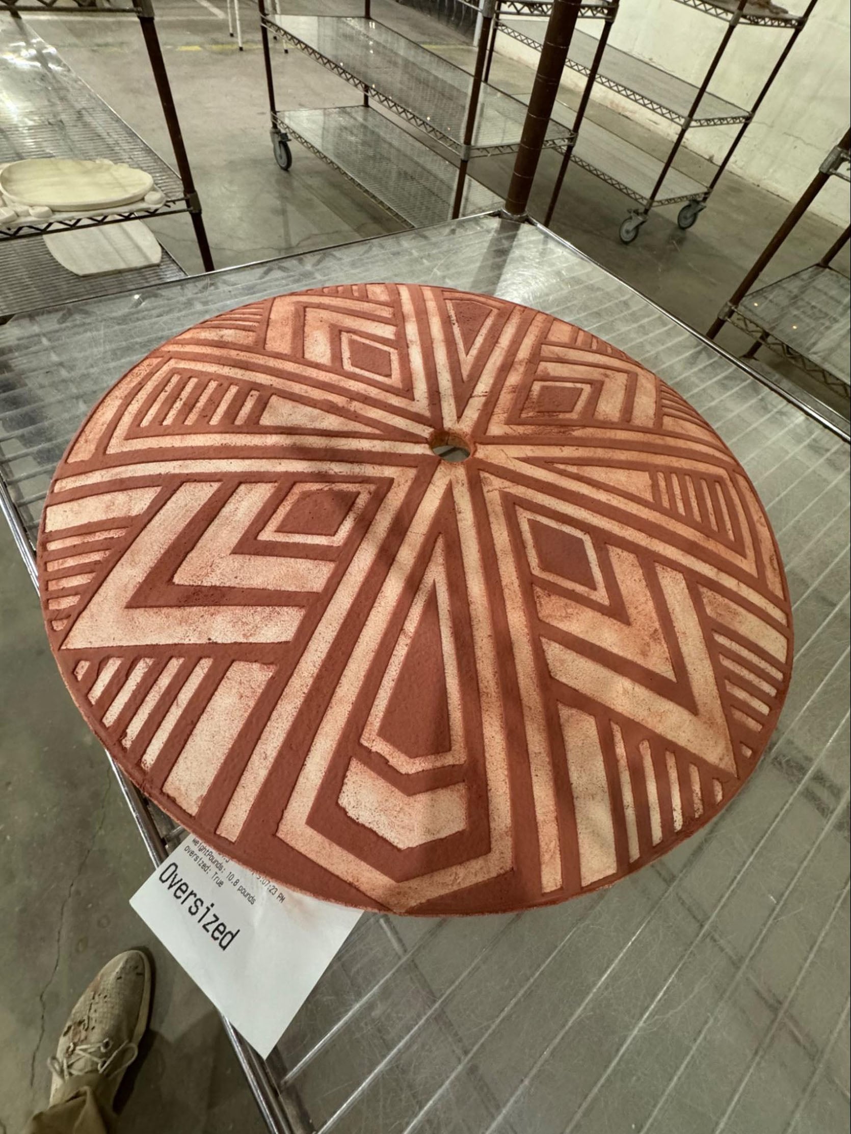
Another light fixture, in process.
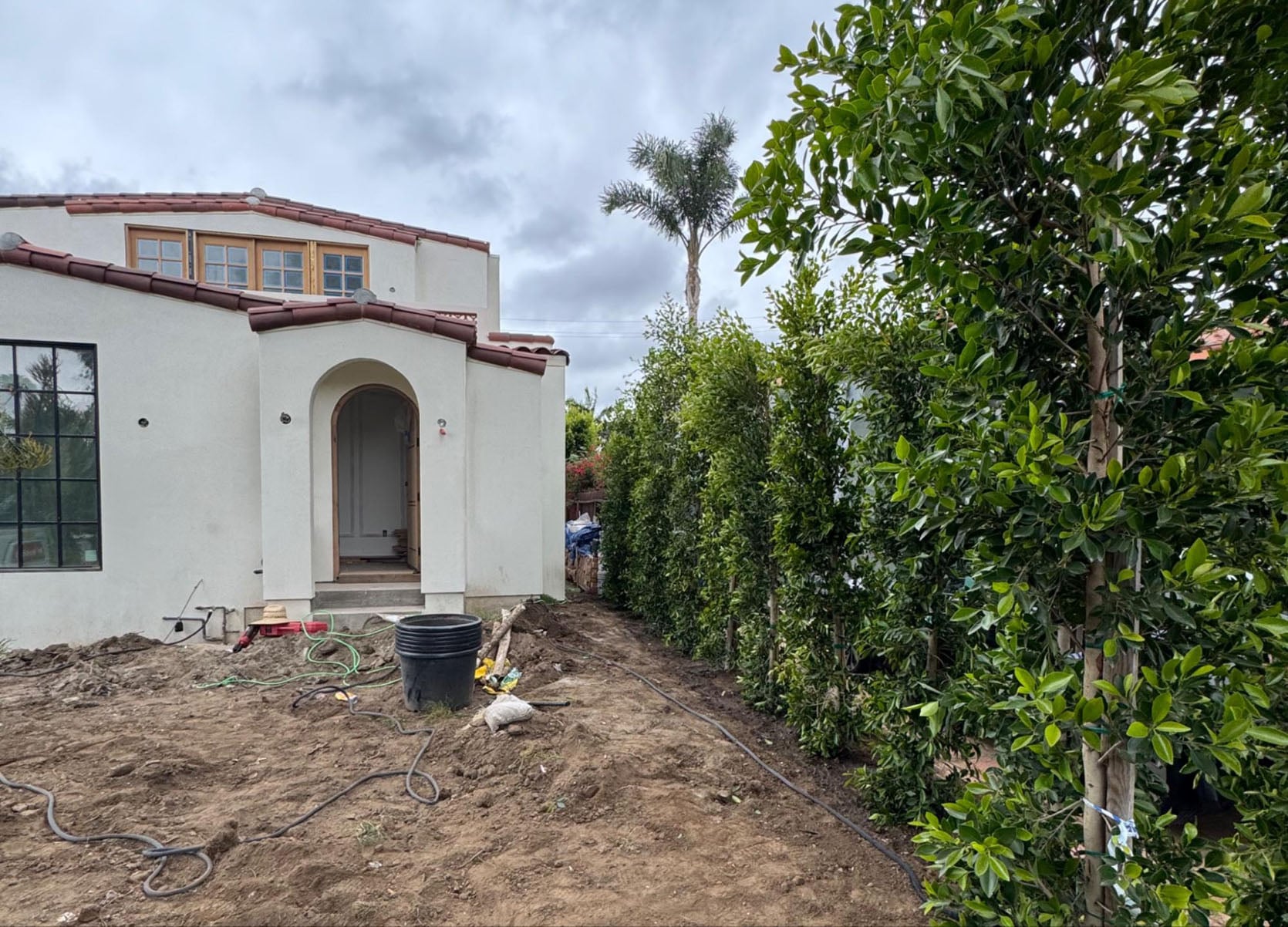
And finally, here’s a preview of the front of the house… I really love how it turned out! We’ll be back to reveal this house soon! Stay tuned!
*Opening photo by Tessa Neustadt