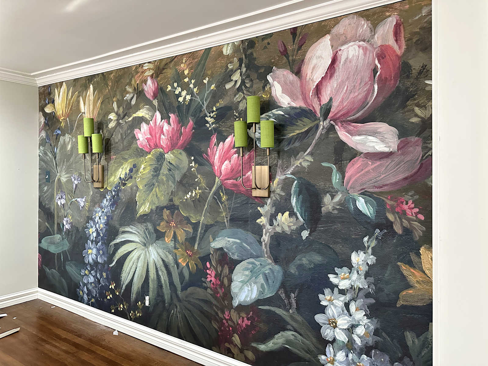
A Pattern Expert Gives Us The Formula For Nailing Printed Wallpaper + Curtain Combinations (& 12 Shoppable Pairings)

As someone who loves pattern and color, I can comfortably admit that nailing the mix of both of those elements can be really hard. I’m constantly second-guessing myself in what patterns work together, what colors marry beautifully. But as I work on some rooms in my new home, including my home office, I’m tempted to push the limits in terms of design elements. Being that that room in particular is compact and won’t have a ton of furniture in it, I want to be sure it still feels inspiring, creative, and exciting.
Chewing on that idea and wondering what I could do to land that vibe, I saw an email come across from the PR rep of wallpaper company Chasing Paper: They were launching a line of fabrics that would easily coordinate with a selection of their existing wallpaper offerings. I was incredibly pleased with how well their peel-and-stick paper came off the walls of my previous rental kitchen, so I started digging around for a paper for my office, and, because I’m getting wild, a fabric I could use to make drapes for the same space. Pattern-and-pattern in this application always stops me in my scrolling tracks when I see it done well. I’ve written time and again about how to successfully mix patterns across decor such as throw pillows or bedding, but never wall-coverings and window coverings. Certainly, many of the same rules would apply, but since I was tapped into the company already via email, I decided to send along some questions to Elizabeth Rees, the founder of Chasing Paper, and get her expert take on what to consider if you want to pull off print layering between walls and windows as I planned on doing.
Here’s what she had to say on the matter:
How to Successfully Pair Patterns in Curtains & Wallpaper
EHD: Pattern mixing between curtains and wallpaper can be daunting. What’s one tip you have to get good chemistry between prints?
Elizabeth Rees: When it comes to choosing prints to mix across fabric curtains and wallpaper, scale is one of the most important considerations to ensure a cohesive design. If both the fabric and wallpaper feature small-scale prints, that can create a distracting, dizzying effect; on the other hand, if both prints are large in scale, the result can be overwhelming and chaotic. Here’s my go-to formula: Choose one medium-scale print for either the wallpaper or curtains and pair that with one medium or small-scale print for the other design element. Try mixing a fun stripe with a block-print floral; it’s a go-to combination for this reason.
EHD: Scale, got it. Now, let’s give people some more avenues to finding corresponding patterns between both curtains and wallpaper.
ER: Whether you’re choosing both new wallpaper and curtains for a full room makeover, or looking to update either design element to enhance the other, these are my top considerations for choosing cohesive prints across the two:
- Color is one of the easiest ways to ensure visual harmony across wallpaper and curtains, even if there are multiple prints and patterns featured. Whether the two are monochrome or feature complementary colors, when there is coordination between the color palettes, it creates a seamless, layered result without becoming overwhelming.
- Contrast is your friend when mixing patterns and materials. When matching an abstract stripe design with a delicate floral, for example, you can achieve a balanced, visually interesting design without distracting from either print.
- Without matching or being exactly the same, the two prints should look like they belong in the same family and tell similar visual stories. Think about the overall aesthetic of the room before choosing individual prints to ensure that the space feels intentional and cohesive once complete.
EHD: What about when you’re going for a pattern- drenched look? How do you avoid the room looking too overwhelming?
ER: Pattern drenching can be an effective design style in both big and small spaces, but there are a few key factors to consider when deciding to utilize one all-over print or not. One common mistake when pattern drenching is forgetting to consider how the rest of the furniture and décor will interact with the drenched print. Pattern drenching makes such a statement that the rest of the room needs to be carefully curated with this in mind so as not to become visually overwhelming.
Again, the scale of a pattern or print is one of the most important considerations for an all-over pattern drenching design. If a print is too small, it can have a dizzying effect when used everywhere in the room, and on the other hand, larger prints run the risk of being too in your face and usually don’t flow as well throughout the room. In terms of color, prints with darker colors will make a bigger design impact in the space versus those with very light colors and lots of blank whitespace.
EHD: Does fabric choice and texture matter?
ER: The type of fabric used for curtains impacts the overall look and feel of a design, especially when layering with other elements like wallpaper. Sheer fabric is versatile, luxurious, lightweight, and allows more natural sunlight to enter a room compared to a linen-cotton blend fabric. Natural light can impact the appearance of design elements, so it is especially important to consider how much light is desired in a room when mixing and matching prints across curtains and wallpaper.
While sheer fabrics are light and luxurious, a linen-cotton blend fabric, on the other hand, has a textured weave which can beautifully enhance prints and patterns, making a more drastic visual impact. Texture adds dimension to the room, making it feel more lived in and adding visual interest.
EHD: What advice can you give someone who wants to use both Roman shades and draperies? Should you keep one solid, or is it okay to go all in with patterns on each? How do you do that, if so?
ER: It’s totally possible to incorporate printed fabric in both Roman shades and draperies within one room. The same rules and considerations for print mixing apply when choosing a duo of patterns to utilize for paired window treatments. Think about scale, contrast, texture, and, of course, natural light to help determine which prints can be mixed and matched together. My biggest advice is if you’re going for the print-layering look, really go for it and trust the process!
Thank you, Elizabeth! After studying her answers, I was able to dissect four “categories” for approaches to mixing patterns across window dressings and wallcoverings:
- Match by color palette cohesion
- Mix simple & complex patterns (such as a stripe and a floral)
- Vary scale (try a medium- or large-scale print with a small-scale print)
- Go bold with a pattern drench
Let’s dive into what that looks like in application, and walk through some off-the-shelf shopping picks.
Color Palette Cohesion
While Elizabeth’s #1 tip was about scale, I wanted to start with what I think might be the easiest way to combine prints: Similar colors. Got a sky blue color in your wallpaper pattern? Pick a curtain with some sky blue in it. That’s the one through-line to bring the elements together. They should, of course, still feel like they belong to the same realm of design; I wouldn’t pick an ultra-contemporary graphic and pair it with a very traditional toile or botanical, for instance. Is there a designer out there that could rock that look? Probably, but I’m not one of them. Keep your colors same-same, and chances are, it’ll work. Some examples below.
Honey yellow in the check of the Roman shade pairs harmoniously with the honey yellow print of the wallpaper. If you’re drawn to the look but are afraid of overwhelming your senses, this is an ideal way to try it. Make sure your paper and your window covering fabric only consist of one main color on a neutral backdrop. It’ll feel very intentional and cohesive.
Here’s another version of that again, this time in grassy green by Alisa Bovino of A Glass of Bovino. It works.
A master of pattern layering, Heidi Caillier shifted this concept just a touch by staying in the same color family (ochre/mustard/brown) but varying the level of the shade to introduce some more visual interest.
Pulling inspiration from the above and Rees’ rules, I put together three pairings to help you further understand how to accomplish this on your own. It’s one thing to see someone else do it, but another thing to not freeze and panic when you’re on your own to get it done.
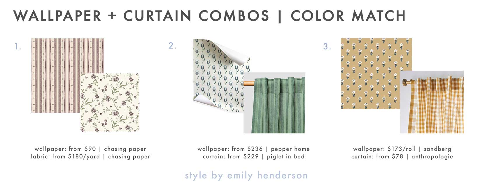
1. Trio Stripe Peel and Stick Wallpaper in Mauve | Waverly Fabric in Mauve Petal | 2. Annabelle Amalfi Removable Wallpaper | Pine Green Pembroke Stripe Linen Blend Curtains (Pair) | 3. Betty, Honey Wallpaper | Cotton Linen Gingham Curtain in Honey
The combo in the #1 spot is from Chasing Paper, and while I feel like I’m cheating a little bit given that that is fabric and not curtains, you can stretch your imagination if you’re handy with a sewing machine as I am. Both of these feature a mauve color way; buying both wallpaper and curtains or fabric from the same company is an easy way to ensure your colors are an exact match!
For the #2 pairing, I could have either pulled out the green or the blue of the wallpaper, but I saw these monochrome stripe curtains from Piglet in Bed, and had to put them together!
And #3 is a tiny bit of a stretch; the yellows aren’t exact, but in the same room with plenty of natural light, I think the brown-toned yellows would work beautifully together; both patterns being charming make them even more cohesive.
Large-Scale + Small-Scale
Now we’re on to scale. Rees mentioned medium-scale with either medium-scale or small-scale, but I’m expanding this to something a bit more obvious, since we’re all learning here. Finding a pattern that has a large-scale motif works best when you pair it with a compact motif. Two giant prints will compete with each other, and two tiny little prints might make you dizzy.
A splattered fabric on the sink and shower curtain (hey, it still applies, okay?) feels just right with a chunky checkerboard tile (I’m pretending it’s wallpaper for the sake of illustrating my point). This bathroom is by Claire Brody.
Another one from Domino (this time, designed by HCO Interiors) that features a large botanical wallpaper in a bathroom with a shower curtain sporting a small half-moon design. In this case, these two are cohesive both because of the right blend of scale as well as a tight color palette.
When a pattern is small enough, it can register nearly as a solid color but still get some texture across. Such is the case in this dining room by Heidi Caillier we’re seeing on Lulu & Georgia’s account.
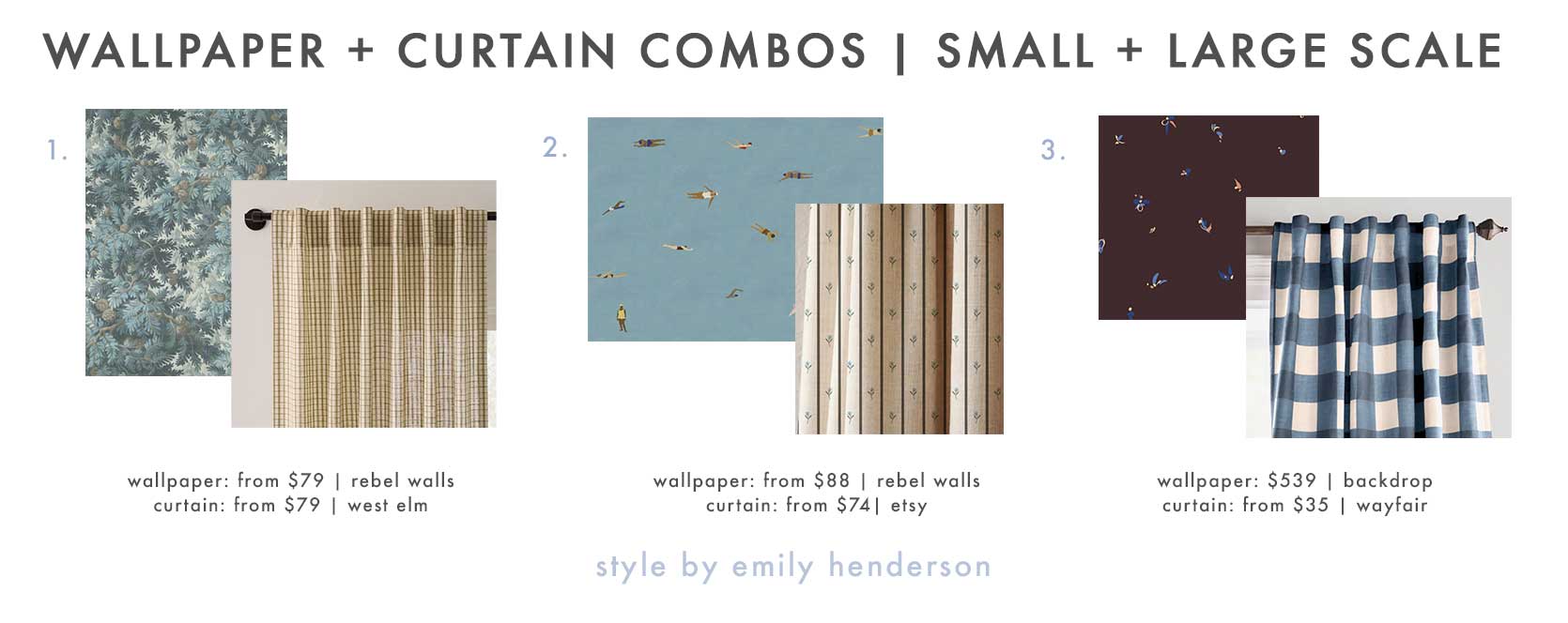
1. Spruce Forest, Blue | Gingham Curtain in Dark Olive | 2. Swimmers, Blue | Blue Floral Linen Curtain Panel | 3. La Belle Wallpaper in Warm Purple | Eudell Plaid Room Darkening Thermal Single Curtain Panel
This one was a lot of fun to put together, and I’m very excited by each of these in their own way. Rebel Walls is a great site to find large-scale prints, like the forest scene in #1, or the swimmers in #2 (they look small in my screenshot, but if you click over, you’ll see that the pattern repeat is quite big). Each of these is paired with a print of a much smaller scale (the gingham in #1 from West Elm, and the floral stripe from #2. I flipped the narrative on #3 with a teenie abstract paper I’ve long loved from Backdrop (it’s pricey but that’s for a 11-yard long roll), and did a super affordable curtain in a beefy buffalo check instead in a blue similar to the one in the paper’s colorway.
Stripes + Floral
Stripes (or checks) plus florals and botanicals is such a fantastic formula to follow for anyone looking to accomplish some pattern layering without being overwhelming, both emotionally in terms of picking a pairing, and visually. You may have already noticed some I put together under different categories because it’s fairly effortless.
Dabito used an Anthropologie curtain as a shower curtain (love it). Its terra-cotta stripe pulls in some of the subtle warm reddish color in the lemon wallpaper without competing with it. (Hot tip for color palettes: If you want something that feels clean, simple and harmonious, pick one of the main colors of something like a wallpaper or rug and use that in other details. But if you want it to feel more interesting and eclectic, pull one of the colors used in the smallest ratio. It’ll still match perfectly, but just adds a touch more tension.)
I just can’t help myself using Heidi Caillier rooms again and again in this post. This is from her collaboration with Lulu & Georgia, and this is one of those “I would never think to do it, but it totally works” moments between the wallpaper and curtains. Keeping one of the elements (in this case, the wallpaper) a single dominant color makes the pairing with the other element way easier to pull off if it has more going on. The greens match across both, which makes the two styles meld in a cool, unusual way.
The above is a carousel of images, but I’m only going to be referencing the first image. A sweet floral blockprint wallpaper pulls the green into a gingham sink skirt. So cute and friendly.
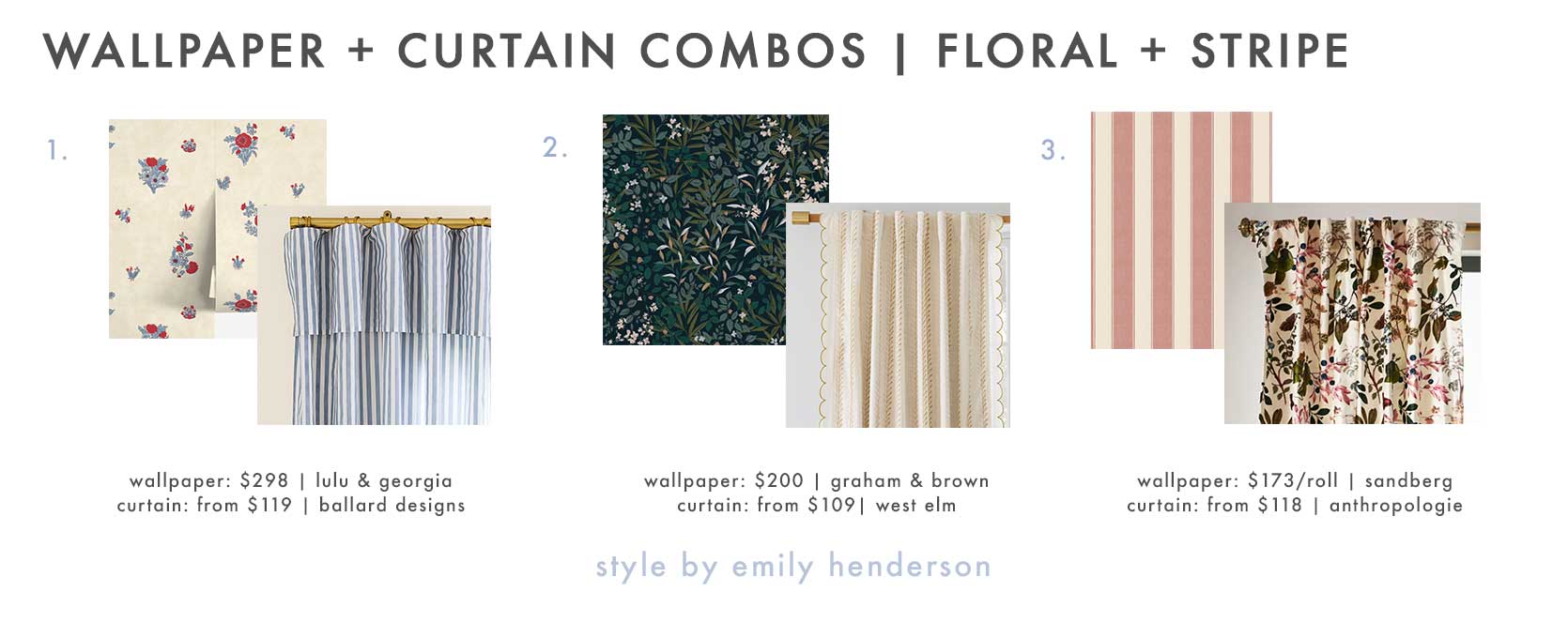
1. Mayfair Wallpaper by Heidi Caillier | Classic Stripe Ruffled Drapery Panel | 2. Reverie Navy Wallpaper | Joseph Altuzarra Vines Stripe Blackout Curtain in Alabaster w/ Lilac | 3. Henrik, Red | Lorena Printed Velvet Curtain
Okay, I’m kind of obsessed with that Mayfair wallpaper by Heidi Caillier for Lulu & Georgia with the ruffled drape in a soft denim blue. Right?!? For something more free-flowing, I picked this Reverie wallpaper that’s more “leaf” than “floral,” but it still applies to this category. As does the whispery soft stripe on the scalloped panel from West Elm. And finally, a thick striped wallpaper from Sandberg feels bold and takes up a lot of visual presence against the printed velvet curtain panel, but because the colors are so cohesive, neither dominates the other.
Pattern Drenched
Our final category is both the easiest and the boldest one: Pattern drenching. Not for the design-cautious, but so fun if you’re brave enough. For as long as I’ve been in this industry (15 years), matching your drapes to your walls was a custom project that you’d have to get done through a designer or workroom. But today, there are so many mainstream retailers making this possible without the custom price tag. West Elm, Spoonflower, Chasing Paper, Lulu & Georgia, Etsy, Graham & Brown, and more.
Here’s one by Sarah Sherman Samuel. Her Painterly Stripe design is available both on curtain panels and wallpaper through Lulu & Georgia. The look is cool because it doesn’t break the visual line of design even across the window. It’s low-contrast, but it’s definitely a commitment. You have to absolutely LOVE the pattern to use it in both applications.
Last one by Heidi Caillier, I promise! She’s just so good at this. Here, she used a Nicholas Herbert Ltd scheme on the walls and draperies. This is where fabric choice can also make a big difference. A thicker, less light-filtering cotton, linen or velvet will feel heavier and more dramatic, while a wispy sheer or semi-sheer keeps the look but lightens the visual load.
Design firm Frances Mildred brought the drama to this Hudson Valley home in many ways, but the matching Roman shade lets the wallpaper be the star of the space without adding in any breaks that can disrupt the visual story of a choice like this.
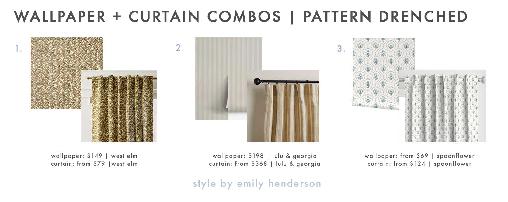
1. Pierce & Ward Floral Lattice Peel & Stick Wallpaper | Pierce & Ward Floral Lattice Curtain in Olive | 2. Painterly Stripe Wallpaper in Natural | Painterly Stripe Linen Curtain Panel in Natural and Ivory | 3. Wallpaper in French Country Floral- Lovely Blues (SM) | Curtain in French Country Floral- Lovely Blues (SM)
I’ve used this pattern from Pierce & Ward for West Elm many times in previous articles, but I didn’t realize the curtains had a matching wallpaper! I can see this pairing in a room with some dramatic woodwork (either in natural wood tones or painted). Yum. And I just had to include the Painterly Stripe by Sarah Sherman Samuel I showcased above. It comes in three colorways, but there’s something really nice about the natural hue. Finally, Spoonflower lets you pair up basically everything in the same print, but note that the scale of the print on the curtain panel is smaller than on the wallpaper, which is actually kind of a cool way to pull off this pattern-drenching look.
This is where I leave you. I’m still tinkering with what I want to see happen in my home office, but any of the above would set my heart ablaze, surely. As always, I hope this was helpful and puts you one step closer to living out your pattern- and color-filled design dreams in your own home.
Until next time, friends.
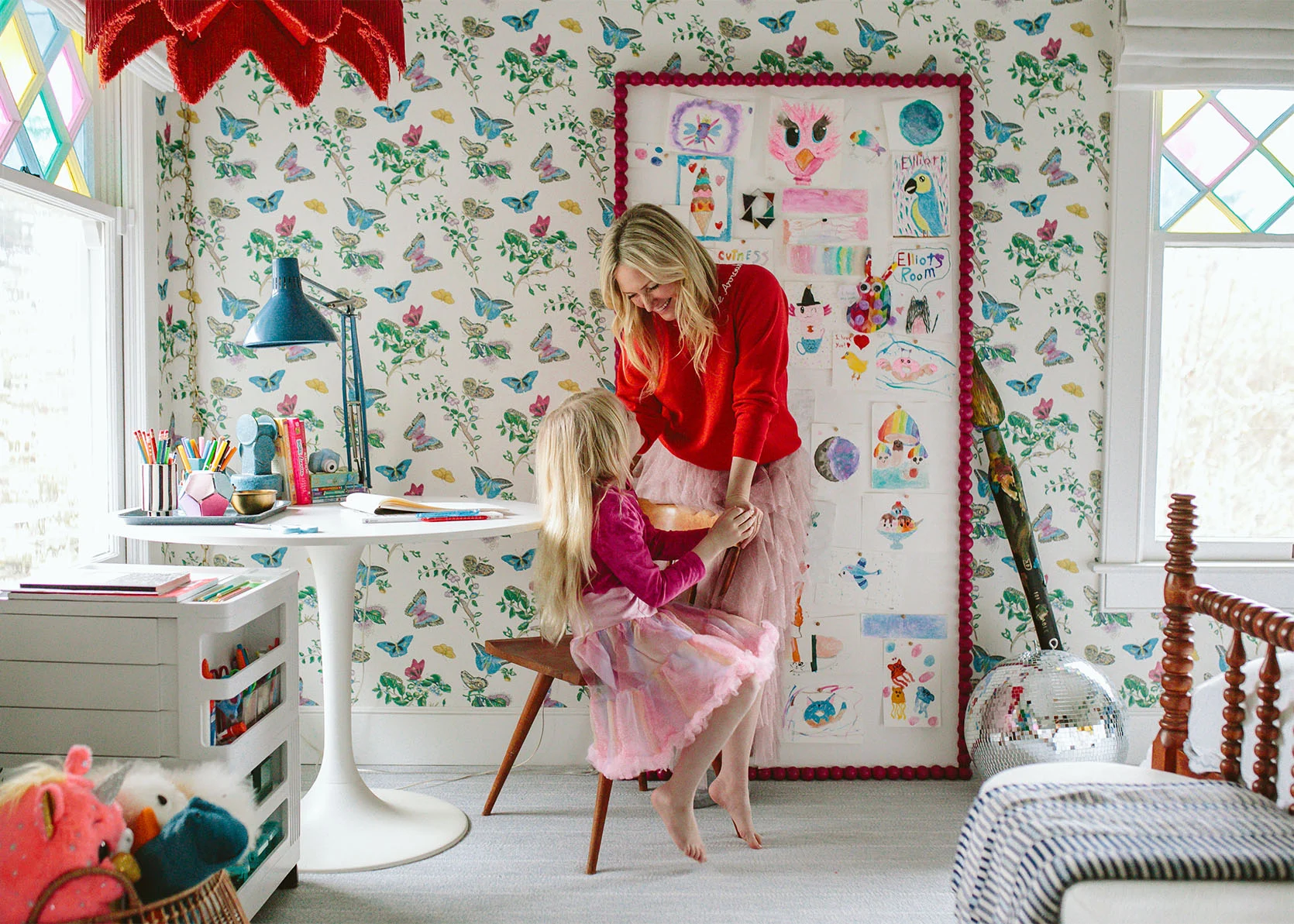
Opening Image Credits: Left: Design by Arlyn Hernandez | Styling by Emily Edith Bowser | Photo by Veronica Crawford | From: Arlyn’s Rental Kitchen Reveal Just Might Have You Wishing You Had Brown—Or Even Cherry— Cabinets (Yes, Really) | Right: Design by Emily Henderson | Photo by Kaitlin Green | From: Another Design Box Checked – The Kids’ Bath Wallpaper Reveal!